Rolling Project Reveal - Living Room and Informal Dining Room
/Today we are revealing the second half of our Rolling Project - the Living Room and Informal Dining Area. We have a lot to share about living room layouts, asymmetrical built-ins and oval tables. These conversations are all about function and we love diving deeper on our function choices because they can apply to any style. Whether you’re into a boho vibe and your house is dripping with rattan and ferns, or you’re into a new traditional vibe and your house is dripping with jewel tones and bird patterns, these function ideas are for you.
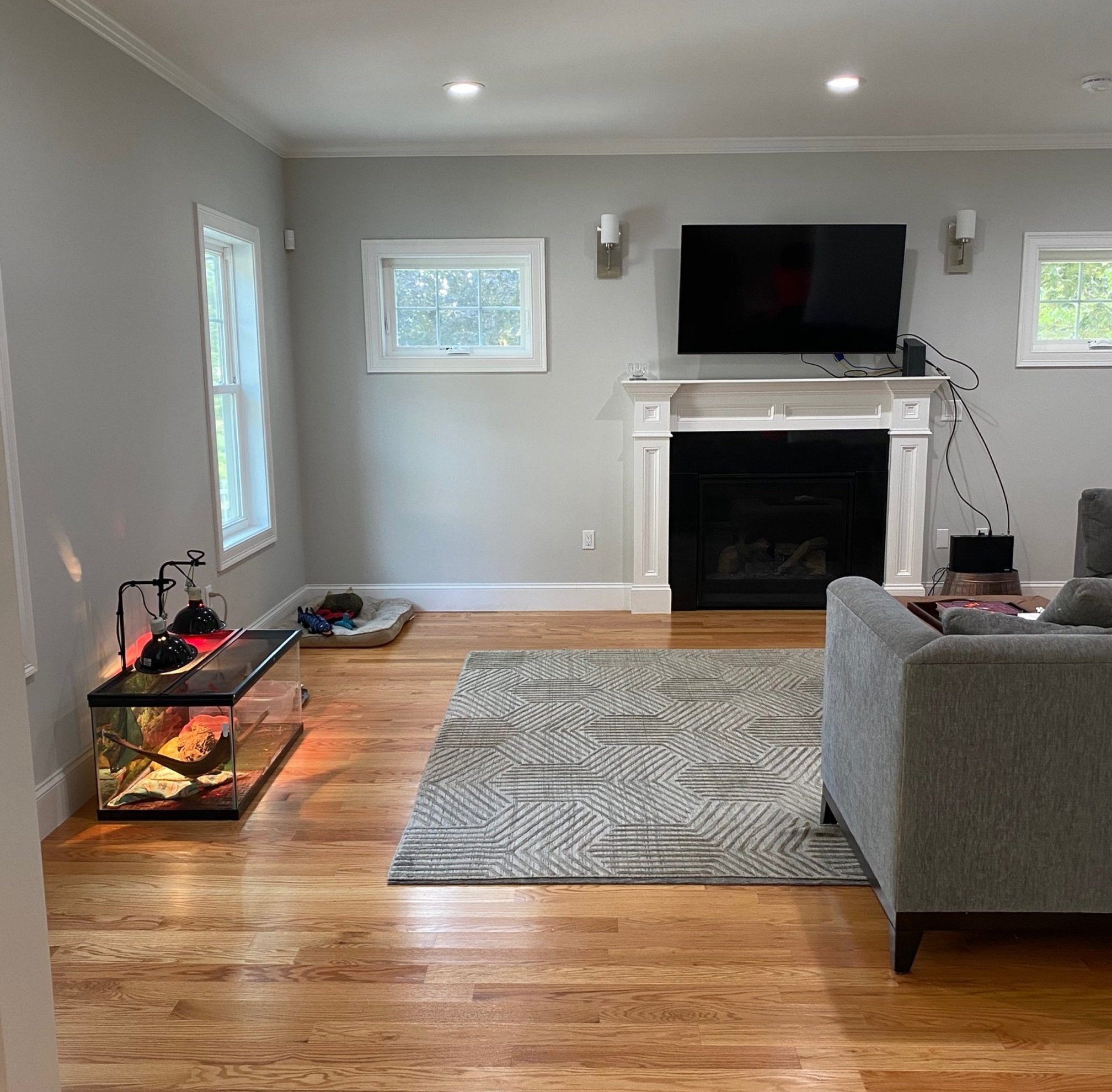
This living room was a standard version of what we’re seeing in more and more new builds - Fireplace flanked by two mini windows that start 2/3 of the way up the wall. Check. Open concept living room and kitchen. In this case, there was a very large cased opening. Check. Big enough to require multiple areas of function. Check.
So let’s address each element.
First, the fireplace set up. We see it All. The. Time. It’s a head scratcher for us. When mini windows flank a fireplace, 2/3 of the way up the wall, it’s calling for a built-in. You can add furniture in lieu of a built-in, of course, but the architecture calls for something on both sides of fireplace. Something to ground the mini windows, so they are not floating by their lonesome at an odd height. And something short enough to not block the windows. Benches or cabinetry (sideboard height).
This mini window trend is not cool, in our humble, but straight forward opinion. It forces a design without executing on that design. Either give the homeowner some creative liberties or finish the job! But, enough whining, it has to be dealt with. And, actually, all homes have immovable elements that must be dealt with…or, ideally, worked with.
This particular room had a slightly bigger challenge. The fireplace is flush to the wall. This meant that built-ins were not a natural solution because they would pop out on either side of the fireplace. We don’t love the look of a recessed fireplace. And, don’t get us started on the builder’s placement of those sconces. Madness.
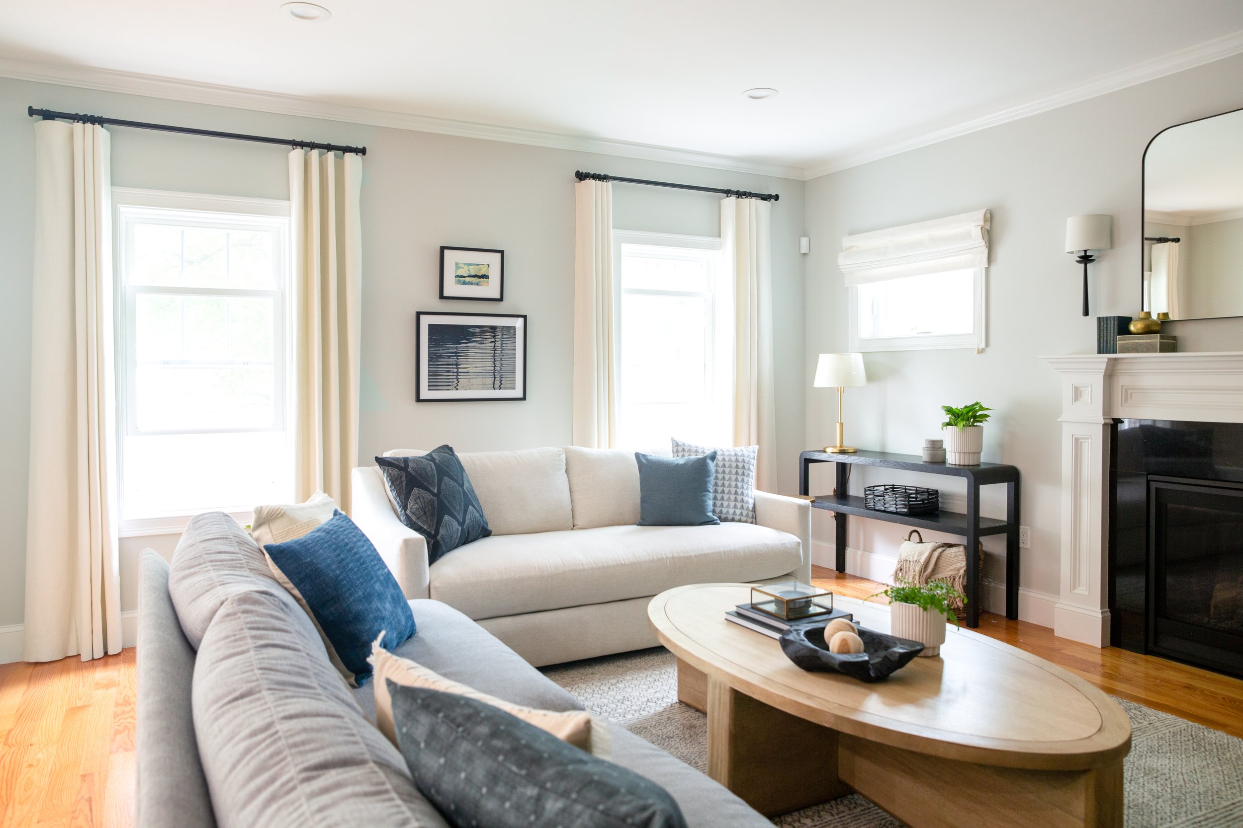
Below is what we came up with: a furniture and decor solution to ground the mini windows, roman shades on the windows so that they didn’t feel so lonely up there on the wall and an asymmetrical built-in on the perpendicular wall that made it feel purposeful (more in a moment).
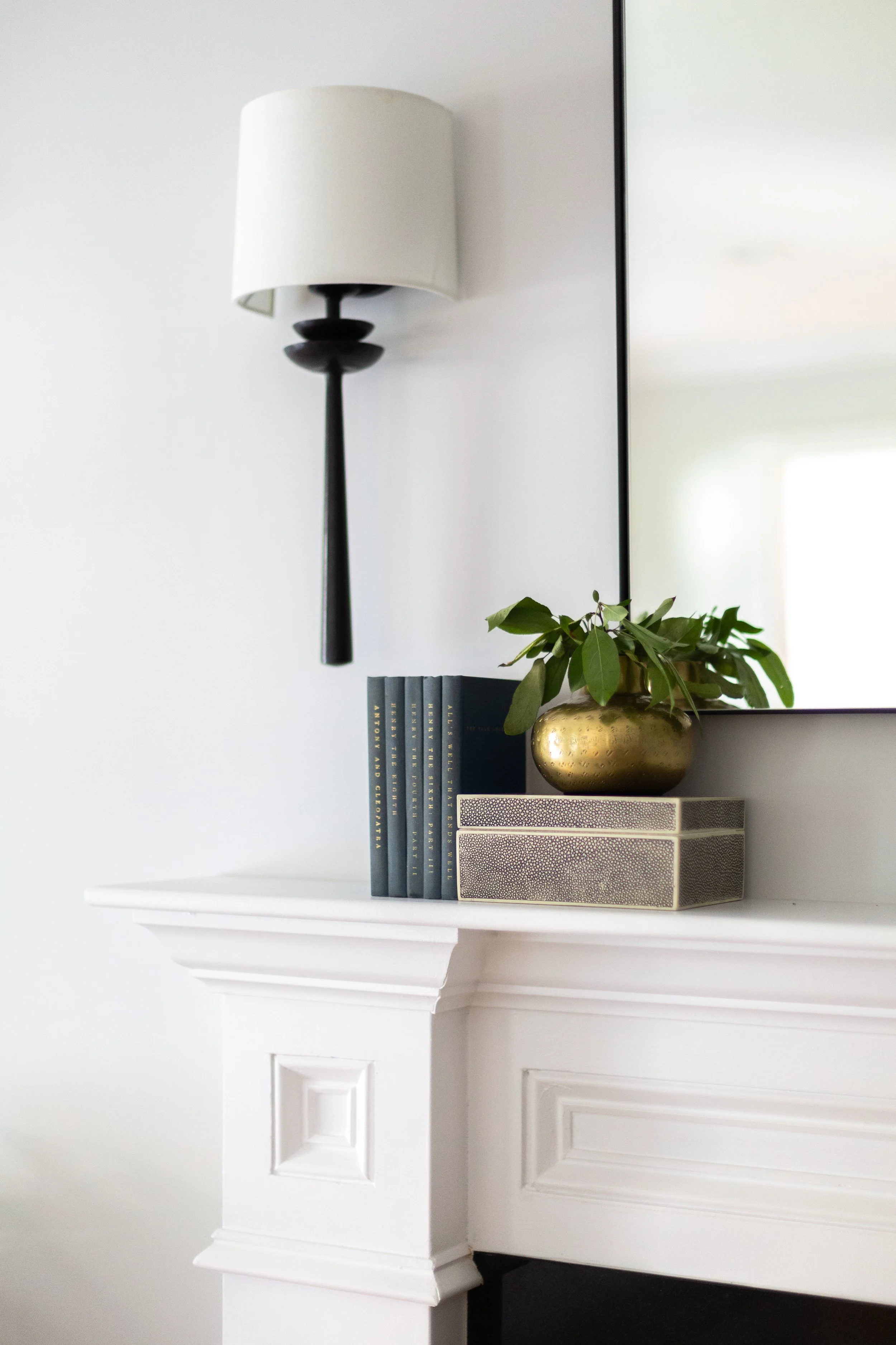
console table / similar table lamp / similar arched mirror / sconces
Before we move on, a couple details of the fireplace wall transformation.
When it comes to an open concept living room/kitchen, the design advice that is most important is to treat the rooms like cousins, not siblings. Friends, not frenemies. The rooms should strongly relate without feeling identical and without competing. You can repeat colors or shapes or patterns, but maybe not all three. It’s important to design the spaces together (as one large space), but give each room it’s unique personality.
Here, we kept the color story very similar - grayscale with some muted blues. Both spaces have oval tables, both spaces mix black and brass metal. But, the dining area has a big moment with the dramatic chandelier and wallpaper, and the living room area has a big moment with the built-in: these statements don’t compete.
similar dining chair / similar oval dining table / banquette / chandelier
Let’s talk about oval tables.
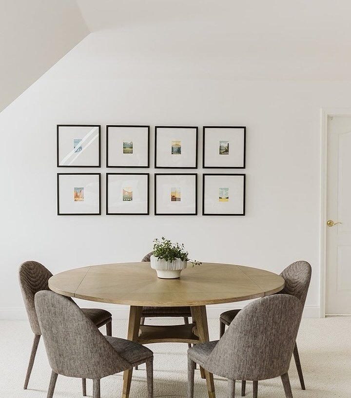
The beauty of an oval or round table is that it allows for a smoother flow of traffic. Some rooms are pass through spaces versus destinations. The informal dining area of this project is flanked by two cased openings and the kitchen island on a third side. There are entrances and exists everywhere. It’s part room/part hallway. The oval dining table eliminates corners and thereby makes a visually easier path and an actual easier path with chairs tucking a bit tighter. Likewise, whenever a sectional or two sofas placed perpendicular (like a sectional) are in the mix, an oval or round table allows for easier navigation.
The last function element to address is what to do with a really large living room. An easy litmus test to decide if a living room is in need of more than one function: will the largest retail rug you can find (typically 12’ x 15’) fill the space? A living room should have a big rug that covers as much floor as possible with the front legs of all furniture on top. For many living rooms, this will be a 9’ x 12’ rug. For some smaller living rooms, this will be an 8’ x 10’ rug. For big living rooms, this will be a 10’ x 14’ rug. And for huge living rooms, this will be a 12’ x 15’ rug.
If you have a big or huge living room and there is still a bowling alley behind the sofa when the legs are pulled onto the rug…it’s time to reassess the layout. You’ll probably want to size down the rug, size up the bowling alley, and make that bowling alley something intentional and useful. Maybe the area behind the sofa becomes a puzzle table or separate seating area. Maybe you add bookcases and poufs. Maybe a small desk and work station. So many choices.
rug / favorite rug pad / similar coffee table / decorative wood balls / brass display box
When we initially drew this living room and played around with the layout, we found ourselves wavering between a 10’ x 14’ rug and a 12’ x 15’ rug. It was a signal to us that the room was too big for a one-purpose layout. When one person will be sitting over 15’+ from another person, or when television viewing is 20’+ away from the TV itself, call Houston. There’s a problem.
In this project, the solve was to create a wall-to-wall built-in media center. This had the effect of shortening the room by 3+ feet. The built-in itself was 2 feet deep and it needed a good foot of clearance in front of it. With this addition, we chose a smaller rug and pulled the furniture closer together. It’s all about striking a balance between spacious and cozy.
similar cabinet pull / sconce / footed white bowl / similar glass globe
The aesthetic details of the built-in are what makes it feel intentional. This is true of any built-in and is especially important when it is asymmetrical. We united the different sides with a consistent backdrop - the vertical tongue and groove. And the crown molding that bends around the unique corners and connects to the rest of the room is key. There are drawers on both sides with matching hardware (matching in style and size). And, of course, it’s painted in one unifying color that contrasts the wall color.
Thanks for following along! Please feel free to ask questions in the comment section below (or shoot us a DM on Instagram). If you missed the prior post about the piano room and foyer of this project you can find it here. And head to our portfolio for many more photos.
Cheers, Leah
*this post contains affiliate links*
