Rolling Project Reveal - Entryway and Piano Room
/Today we are going back in time and revealing details behind our Rolling Project. This is a two part reveal. Part one (today) will detail the entryway and piano room. We have a variety of inspiration for you: how to think about your entryway as part function and part pretty, using stripes in a modern way and the impact of layout.
We began this project in fall 2020 (feels like a lifetime ago) and finished in fall 2021 thanks to a stubbornly delayed dining table that was worth the wait. We designed the living room, piano room, foyer and informal dining area (eat-in part of the eat-in kitchen). The goal of the project was to take a recently purchased new build from builder grade to elevated, unique and welcoming. The palette is neutral with some great high contrast moments.
Entryway
This home has a two part entryway - one that is more driven by function and one that is more driven by beauty. This dichotomy exists in every room. There is usually a woven balance within a single space. But the footprint of this foyer happens to naturally divide the function from the pretty.
When you first walk in the front door/formal entrance of the home, conveniently hidden behind the front door as it opens, is the function. Without a closet, and no place to build one, it was important to create a spot for guest coats. Any guest facing space needs to lead with pretty even if it’s grounded in function. The coat rack is part cool and part vintage, and adds a great touch of character. Some interesting, statement hooks (like these) could have been another option if the wall had been just a touch bigger. We also added a landing space to put on shoes or rest a hand bag. And, finally, a mirror to check your teeth before you head out or flatten your hat head when you come in.
coat rack / similar knit cube / similar mirror / similar leather backpack / black sneakers
It’s a tight spot that manages to handle a lot of purpose. We were able to accomplish this by keeping each element skinny and taking advantage of the vertical space.
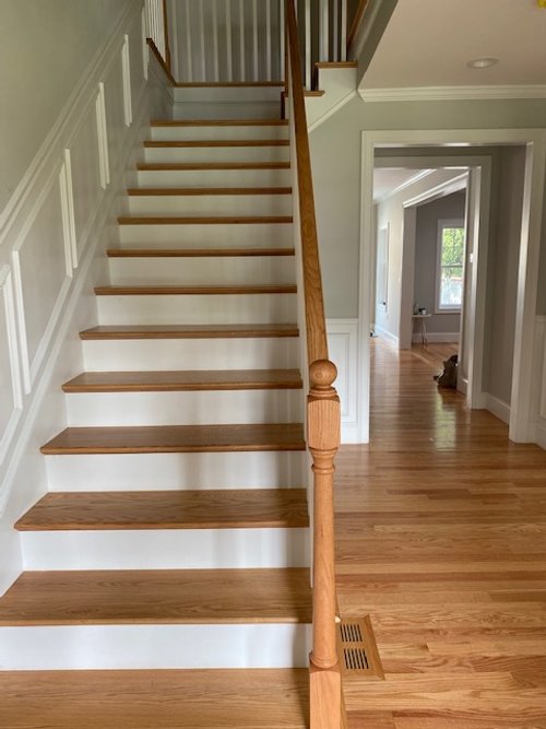
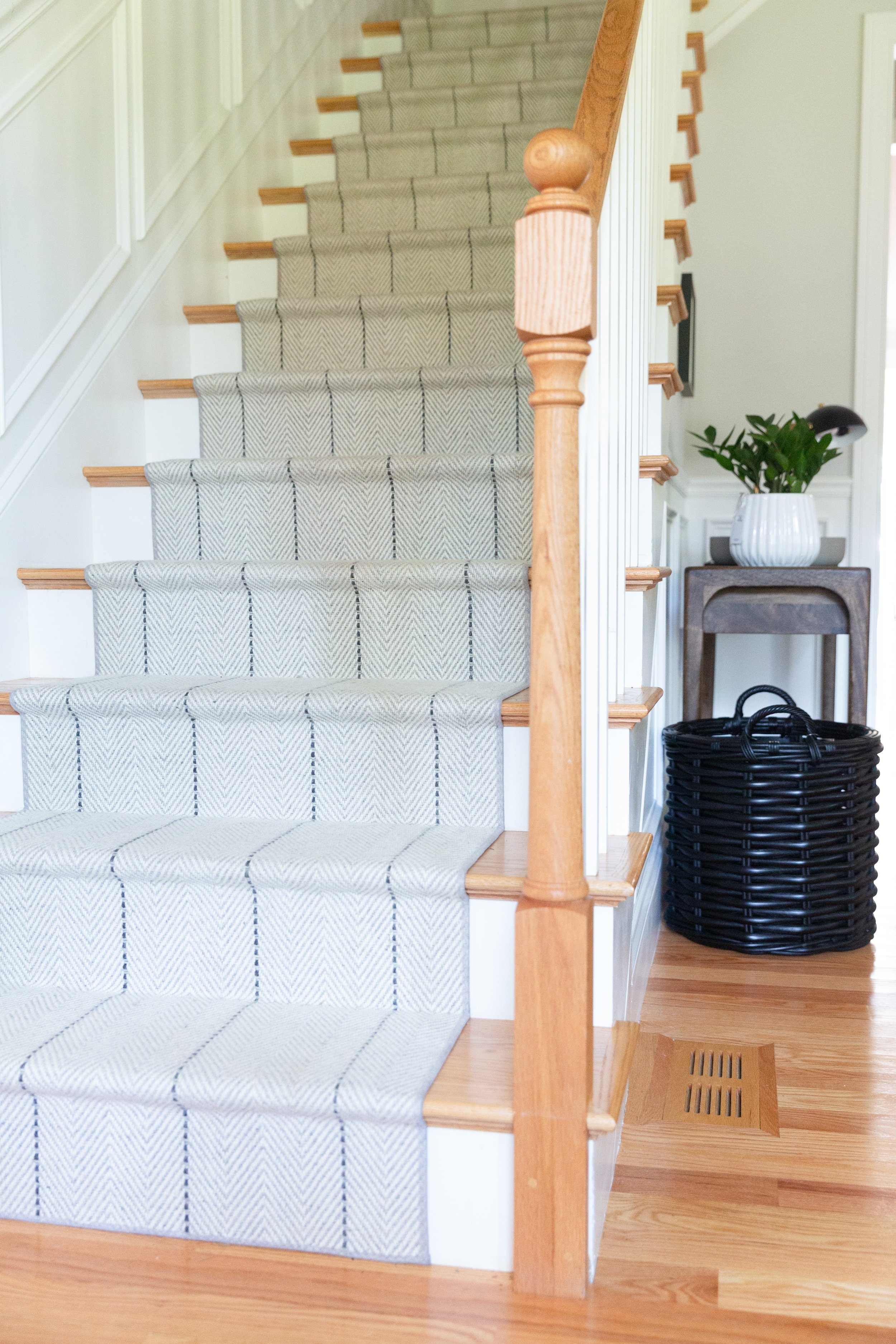
We also made a big visual impact by adding a stair runner. Stair runners are an investment, but also really worth it for families with young children and dogs. They also bring color/texture/personality to a space. And when the first thing you see when you open a door is the stairs, these things matter. The rug style we chose is classic with just a little something. The subtle chevron pattern with the contrasting stripes add the right amount of interest for this project, which has subtle, moody and modern vibes.
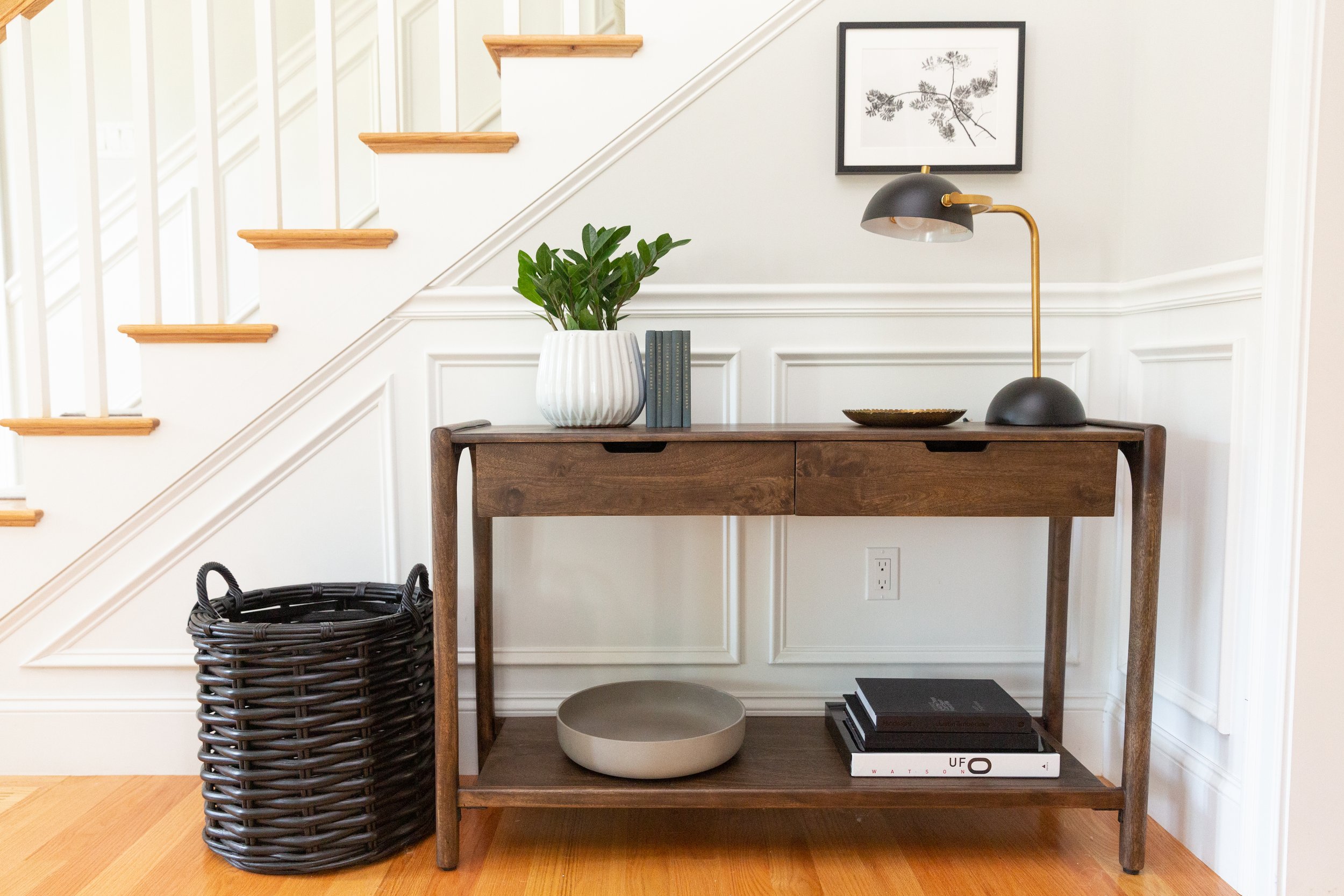
Sitting against the side of the stairs is the pretty part of the entryway. Along with the stairs, the side profile of this space is the opening glance of the home when opening the door. With this, the aesthetic factor took precedent. But, that didn’t mean we threw function to the wayside.
oversized black basket / console table / UFO book / botanical photo
We chose a console table with a lower shelf and two drawers to provide lots of open and hidden storage. We also added functional decor. Oversized, shallow bowls are excellent for corralling keys and mail. And big baskets are excellent for incoming and outgoing packages…or the “quick throw everything in the big basket before the guests come over and throw a pretty blanket on top” move - don’t we all do this?!
Piano Room
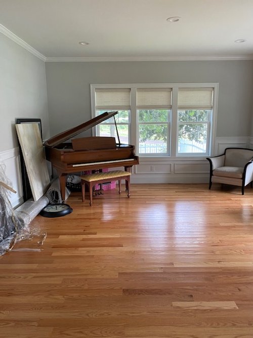
When we started this project there was nothing in the Piano Room other than the piano. We were tasked with creating a transformation using existing furniture (from another room). Designing around existing pieces is a different thing than having creative control over the whole shebang. It’s about finding the perfect pieces that complete the puzzle, rather than creating the puzzle.
Here is a photo from the first day we came onsite.
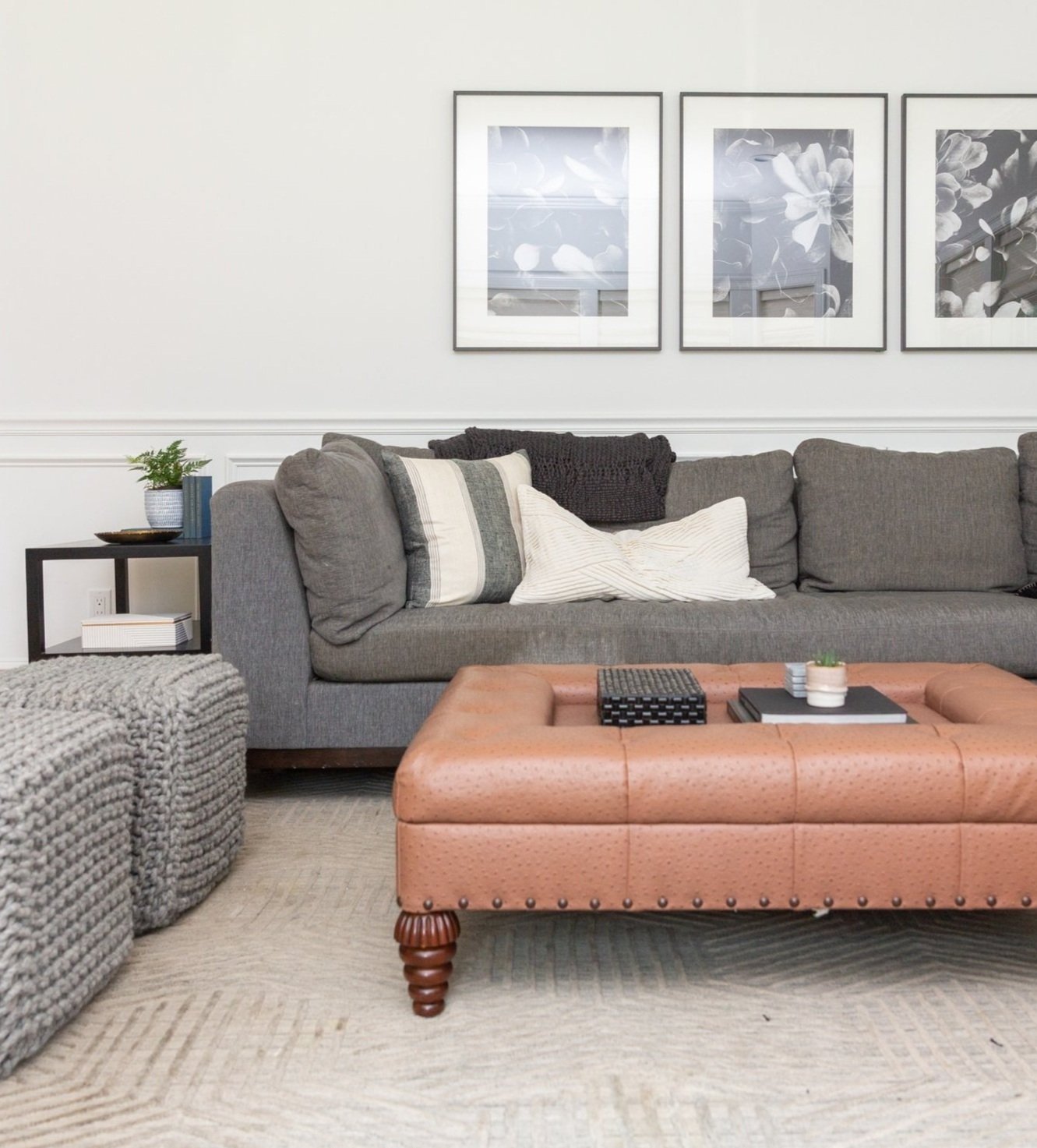
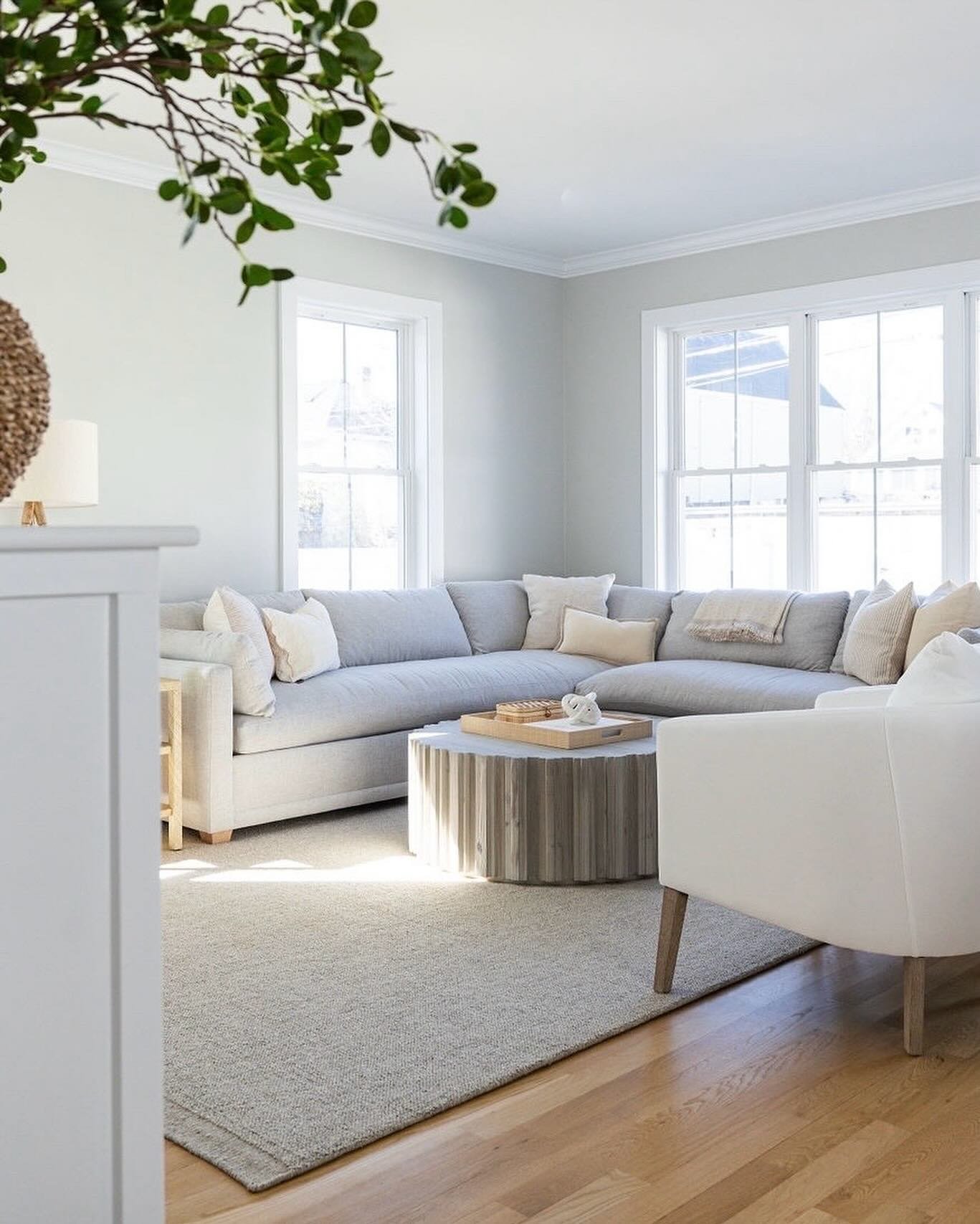
We started by completely reimagining the layout as we considered fitting the existing piano, sectional, coffee table and rug. So often layout is the main thing holding a room back. Here, there is extra, bumped out space thanks to a bay window. By shifting the piano into this bay window nook we were left with a squared off room for squared off furniture. Everything fit cleanly and the room felt bigger. The lesson here is not to fight with the natural angles and shapes of a space.
With all the large furnishings in place, we layered in ancillary furniture that increased function and added personality. A side table next to the sofa arm, a swivel chair/side table/floor lamp scene, lots of decor and art, and a pair of poufs. Poufs are work horses. They are seats, foot rests, plant stands, side tables. They are whatever you need them to be short of a good spot to nap.
black and white flower print / pleated pillow / our favorite off the shelf black frame
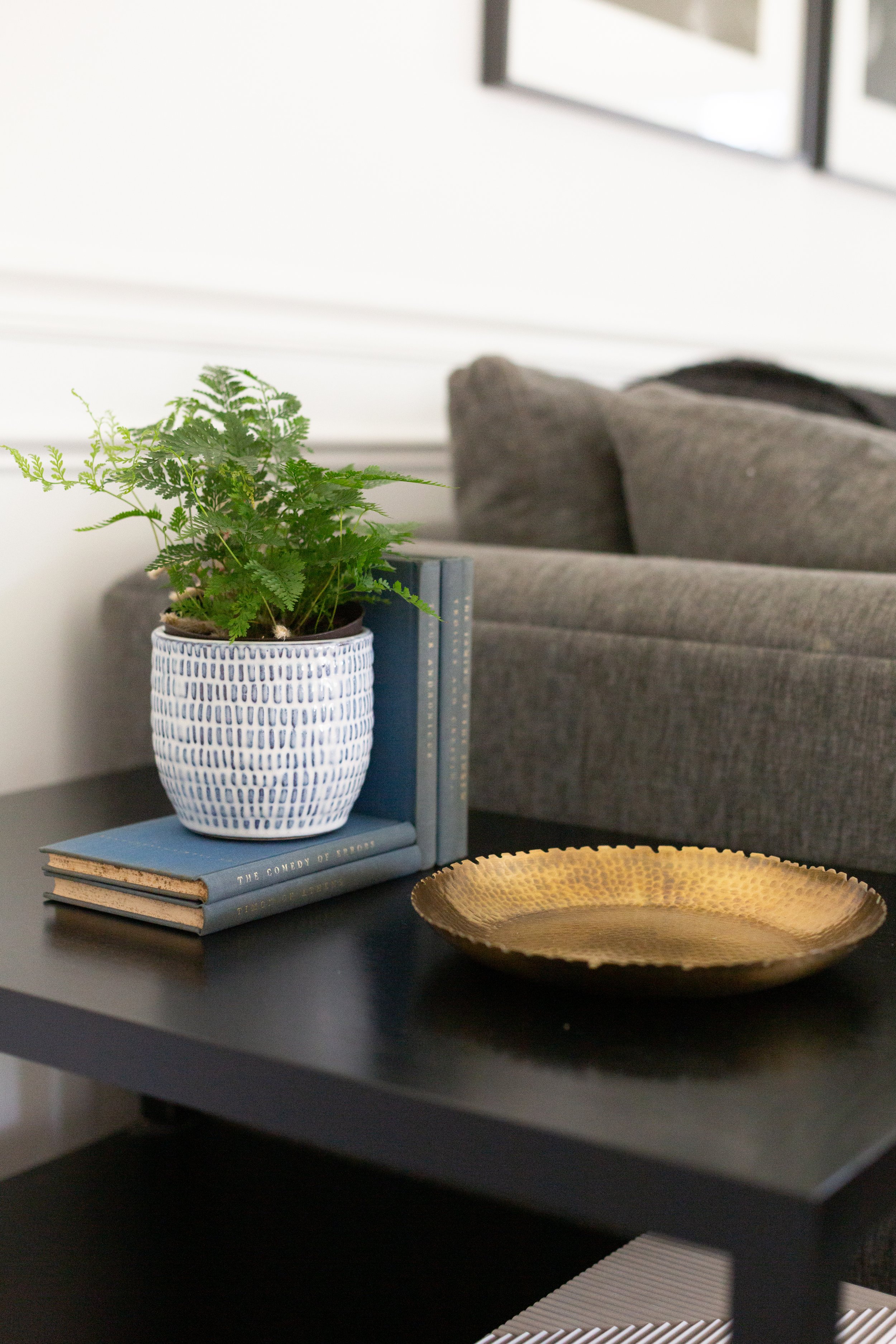
For the swivel chair, we chose a plush fabric with oversized ribbing. The texture was important because the color palette of this room is neutral and muted. We love mixing up shapes and/or sizes and/or colors when it comes to side tables within a room. The side table by the sofa is black, rectangular and tiered. The side table by the swivel is round, pedestal and naturally stained wood.
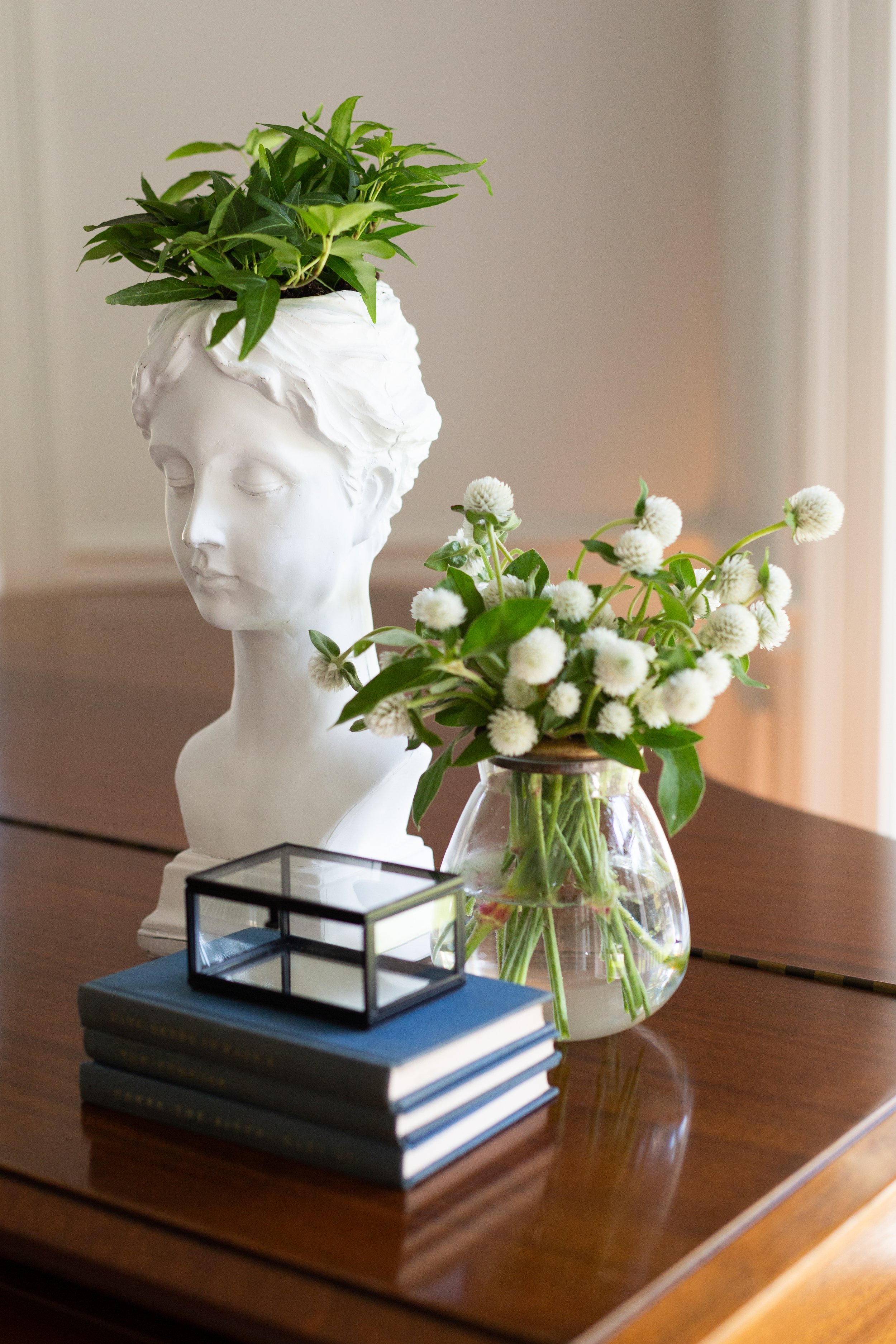
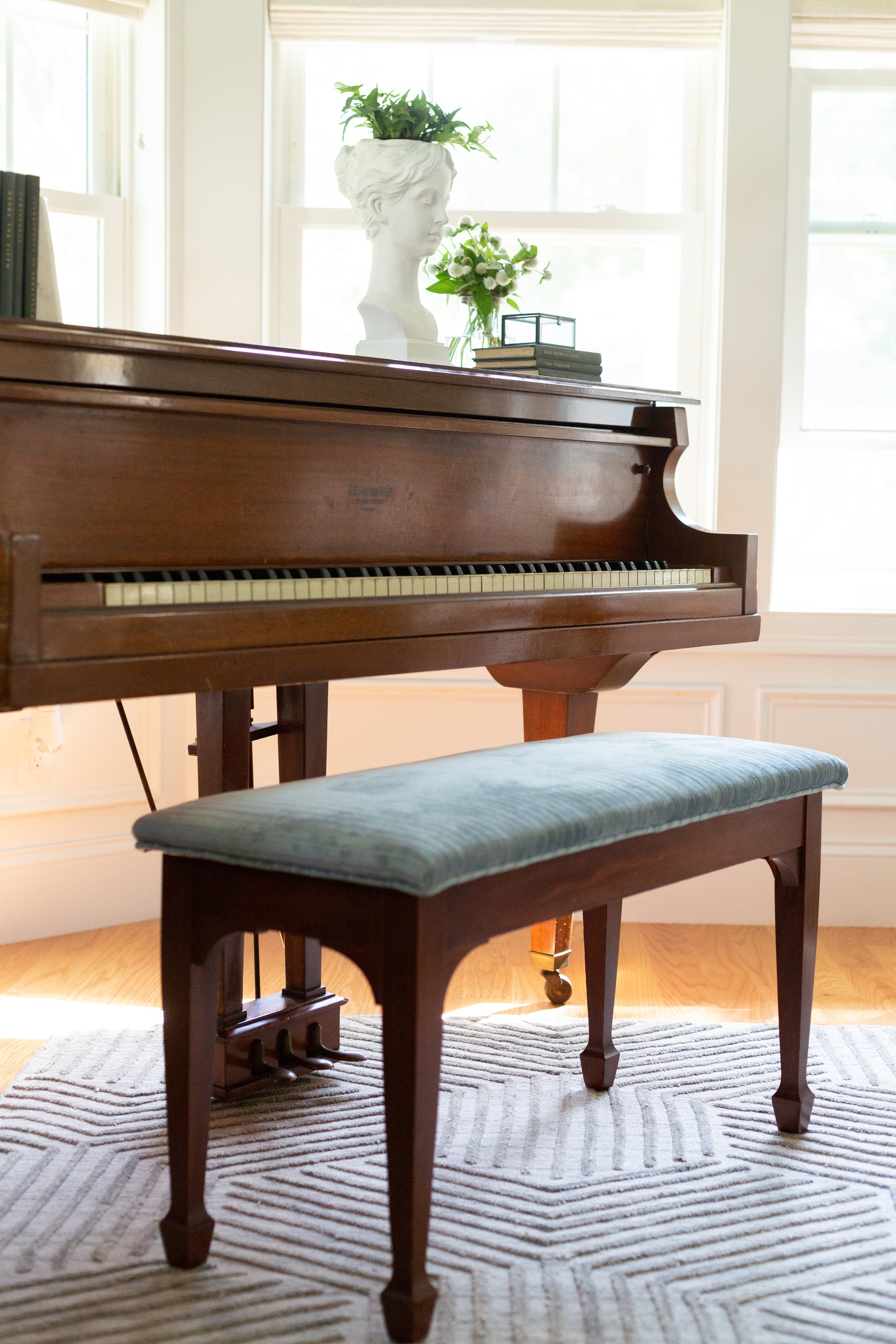
One more fun thing to note about the big picture design for this space: stripes. We introduced and repeated stripes everywhere. The rug is the most obvious stripe pattern. We also added the “striped” swivel and reupholstered the piano bench in a channeled, smoky blue velvet. And if you scroll up, you’ll see lots of stripes in the pillows and even the striped lines of the books we stacked on the piano. And yet, even with all the stripes, ribbing, channeling, pleating and everything in between, it’s not overdone because it’s almost entirely tonal. The stripe concept is more of a texture than a pattern.
floor lamp / side table / Bob Dylan print / similar bust planter / mini glass box
And now the details of the room. We always encourage attention to detail because decor sets a room a part. Some easy things to note are mixing shapes (straight lines with curves), repeating colors but playing with the shade (i.e. dark gray and light gray), and adding as many plants and greenery as possible (says the two plant ladies).
Part 2 of this reveal is coming!
-Leah
*This post contains affiliate links*
