Gray Oak Gives Back

We have a truly awesome announcement for you.

Since establishing Gray Oak Studio in 2017, we have been fortunate to grow our business tremendously and so much of our success is thanks to the support of our local community. Every word of mouth recommendation, every follow on our Facebook page and like on our Instagram posts, every encouraging word in the grocery store check out line by someone who heard through the grapevine about our leap of faith venture. All of it made us feel supported and encouraged and motivated. We are truly lucky to come from such a wonderful place.

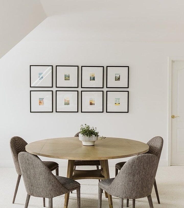
This month, as a thank you to all the inspiring and supportive community members, we are kicking off an annual initiative: Gray Oak Gives Back. We are donating our design services to worthy project - someone truly deserving of a beautiful room transformation. And after finishing a design consultation earlier this month, we knew we had found our special person and our special project.

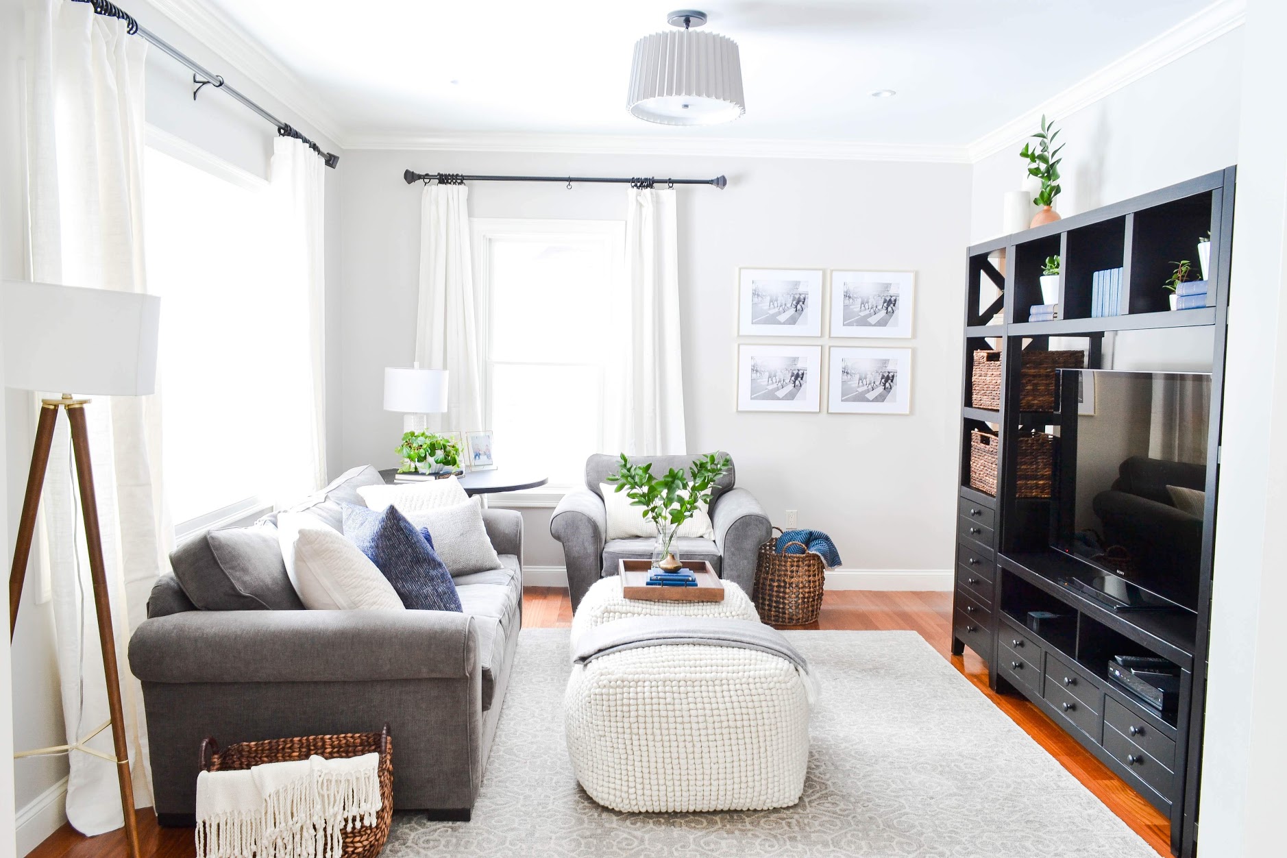
Okay, so let’s dive into the project itself. It’s a living room and the layout is…interesting. Below is a relatively accurate Birdseye view.

 
Gray Oak Studio Gives Back - Room Layout
 

Like many older New England homes, there was no TV wall considered in the design. Eighty years ago (this house was built in the 1938), TV wasn’t the time-sucking, oh-so-magical vice that it is nowadays. But, like most modern living rooms, this room needs a TV. And to make that happen we have to contend lots of windows, doors and a large fireplace. More on this layout dilemma to come in the weeks ahead.

The TV is currently in a corner…and we don’t love this plan though we understand why our Client landed with this option. We’re not 100% ruling out the possibility of keeping it here, but we’re at a 90%.

 
Gray Oak Gives Back - Layout Brainstorming - TV Dilemma
 

The fireplace has the potential to be an amazing focal point, but it’s looking a bit underwhelming at the moment between the original (Yes, original.) brass door, the red brick surround and the dated details in the wood mantel. Oh, and the hearth. The red tile hearth, sigh. We got big plans for this guy.

Gray Oak Gives Back - Fireplace BEFORE

This room is also covered in very old wallpaper with original wall sconces instead of overhead lights.

 
Gray Oak Gives Back - Lighting Issues
 

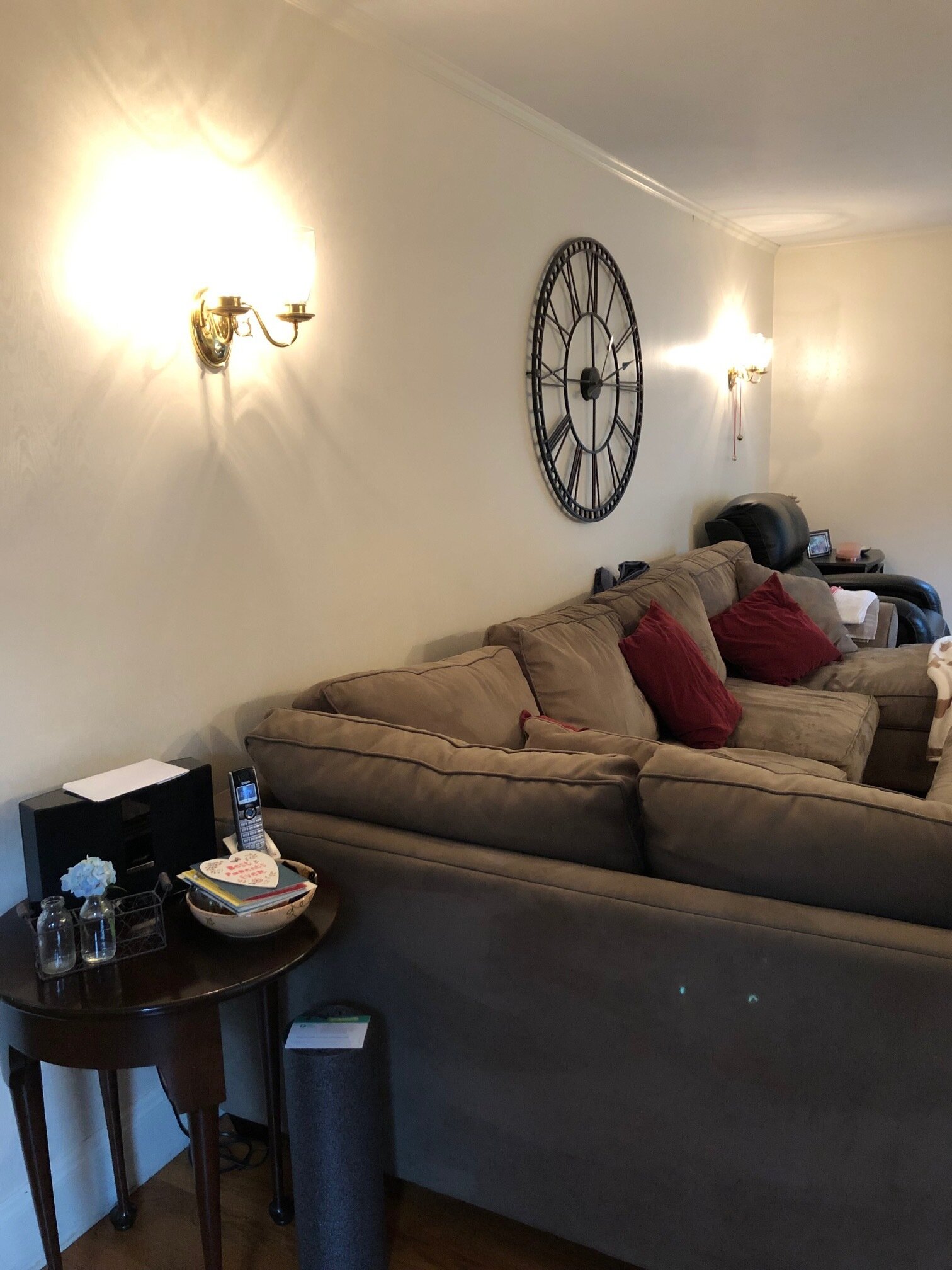
And the furniture is several decades old…several.

 
Gray Oak Gives Back - Dated Furniture
 

So, here is our list of To Dos for this transformation:

  • Remove wallpaper and paint the walls

  • Remove old sconces and add recessed lighting

  • Relocate old sconces above fireplace

  • Update fireplace - new hearth, new surround and maybe a couple other tweaks…

  • New window treatments

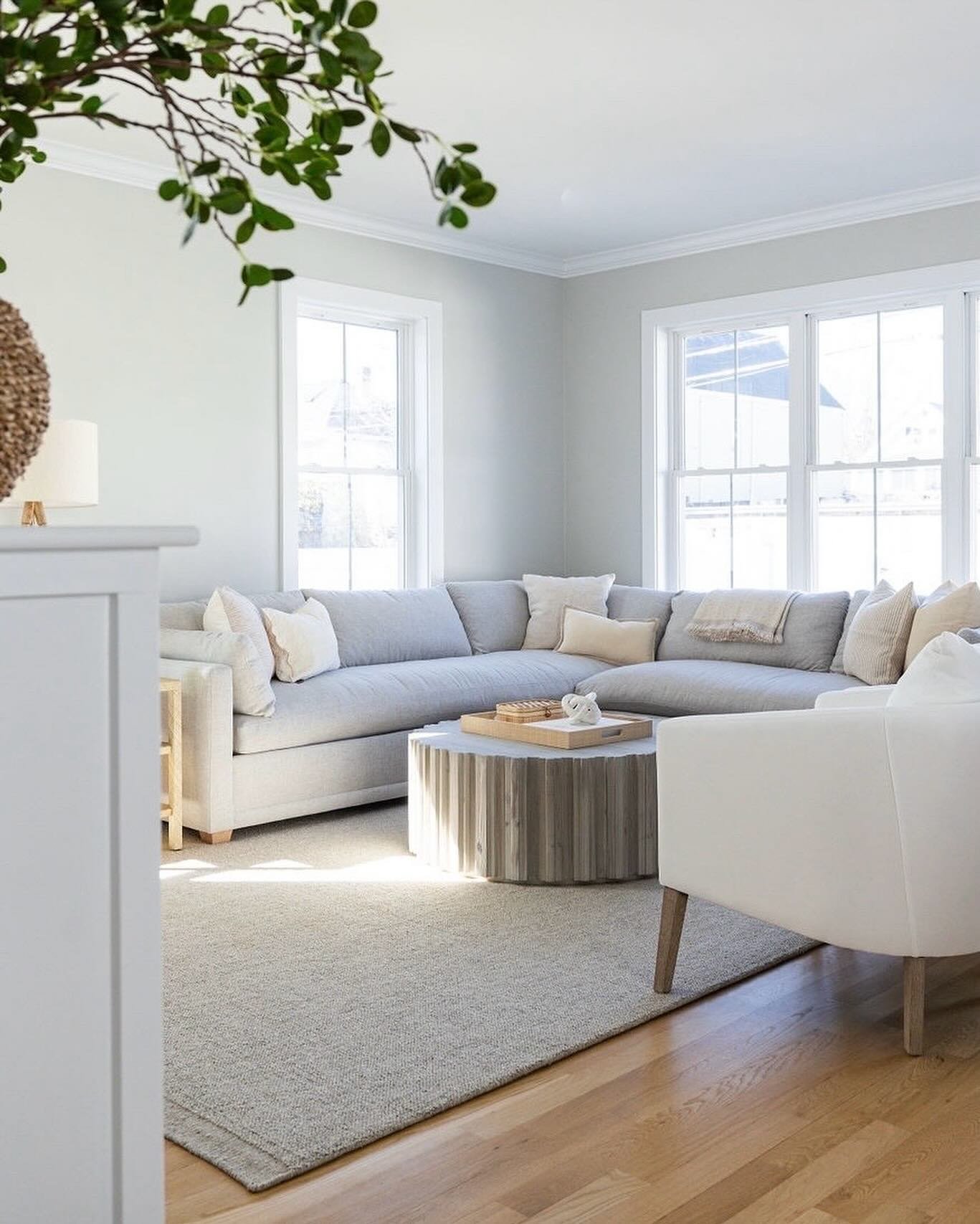
  • All new furniture - sofa, armchairs, coffee table, media console, rug

  • New decor

Here’s the really fun part, we have started a Pinterest page with all of our inspiration and ideas for this project. Please check it out. Leave comments. We would love for you to follow along as we create this special space. And stay tuned for more information on our amazing client. So much fun to come.

- Leah + Sonia

PS - We have a video tour on our Instagram highlights if you want to get a better feel for the room!


5 Easy Updates to Your Family Room

By now, the kids are all back to school and mostly readjusted to the bus, bagged lunch and homework. September is a hectic time of year for families transitioning from the wonderful chaos of summer to the regiment of school and extra curriculars. But, once the dust settles, parents can find themselves with a bit of extra time on their hands. With said extra time the focus is often - Let’s get this house in shape before the holidays are upon us!!! (This line is screamed in true and deep panic as one suddenly realizes that Thanksgiving is 2 months away)

Today, the 2nd day of October…if you’re counting…we’re breaking down 5 easy ways to completely update your family room. And a plan to get it done before Turkey Day!

Below is a “before” photo from our Hutchins Project. This is the state of many a family room before we got our hands on it - fine. Serving a purpose, more or less.

 
Gray Oak Studio - Family Room Refresh - BEFORE photo
 

Below is a photo of the same exact family room after we did a little number on it.

Gray Oak Studio - Hutchins Project Family Room Update

floor lamp / ottoman / brass wall frames

You’ll see that 4 existing pieces of furniture stayed the same: sofa, armchair, rug and media center. Now let’s breakdown what changed.

5 Steps to Updating your Family Room
  1. Lighting

    We added a semi flushmount light fixture, a floor lamp and a table lamp. A variety of light sources allows for multiple activities in a room (one person watching TV, one person reading), adds ambiance (a little mood lighting goes a long way) and creates a wow moment (ceiling lights are masters at creating beauty and interest).

  2. Window Treatments

    Window treatments are the eyebrows of a room. There are definitely exceptions, but as a rule of thumb a room will feel like something is missing without some sort of window treatment. Here we replaced the shorter gray drapes with ivory linen drapes that “just kiss” the floor. When in doubt, white/ivory drapes are always the right choice. They are style chameleons and simultaneously timeless and modern. They cover all bases.

  3. Wall Color

    A fresh coat of paint is an instant refresh to any room. Here we changed the darker puddy color to a crisp, light gray (Nimbus by Benjamin Moore).

  4. Decor

    New throw pillows, blankets, books, baskets, vases and decorative objects are a must of this process. Even if you don’t have time or money for a complete overhaul, be sure to curate a cohesive batch of current decor. Pick a color palette (sticking with 2-3 colors is the easiest way to stay cohesive) and hit up your favorite HomeGoods. We also love Target’s Threshold and Project 62 lines.

  5. Plants

    If you’ve been following us for any length of time, you know that you always incorporate plants in our designs. For good reason. They bring color and texture and height (if you’re going indoor tree style). And, most importantly, they breathe life into a home. They give the feeling of a nurtured, loved home.

The Plan to Get Er Done!

Okay, so, your mind is now bubbling with all the wall color choices you’ve seen on Pinterest (Revere Pewter, Alabaster…could you go dark with Hale Navy?). And you had been eyeing a pillow at HomeGoods last week. But how are you actually going get it done?

  1. Order the light fixture and the window treatments. Anything that needs to be “installed” should be your first purchase.

    - We love these linen curtains and these linen-like curtains. (click links to shop)

  2. Paint the walls.

    - We recently polled our Instagram followers to tell us their favorite white paint color. Check out this post for the results.

  3. Install the light fixture and window treatment. The room is already looking so different!

  4. It’s accessory shopping time. Here is our not-so-secret trick to accessorizing: buy a lot more than you need, bring it all home, mix and match, try this, try that, see it all in the space before you make your final choices, then return what you don’t end up using.

  5. Plant time. If you have a local nursery, we highly recommend going to pick out few plants. The people who work there are a wealth of knowledge and can recommend species that will thrive in your home (amount of light, direction of light, etc.). If you don’t have a local nursery, we have found some awesome, budget-friendly plants at both WholeFoods and Trader Joes.

This is totally doable in 6 weeks - You got this. Happy October!!!

- Leah

*this post contains affiliate links*

Favorite White Paint Colors - Crowd Sourced Results

Well hello there! It’s only been 3 months since our last blog post…

Today, we’re back with something really fun. Last week on Instagram we took a poll asking followers to share their “Favorite White Paint Color”. We got so many responses! And we’re not surprised…I mean, we are in fact surprised because it’s always a fun surprise when we get lots of Instalove…but we’re also not surprised because finding the perfect paint color is a universal curiosity (and thorn).

If you scroll through your Pinterest feed after searching “best white paint color” you’ll find lots of excellent resources. Everything from Studio McGee’s recommendations (here and here) to Emily Henderson’s recommendations (here) to every interior designer ever’s recommendations. While there is definitely some notably overlap of designer favorites, everyone has a slightly different take on when and how to use which crisp/cool/soft/warm white. It’s confusing and overwhelming.

The results of our little poll mixes answers from interior design professionals with answers from DIYers with answers from design curious/mildly interested followers. It’s crowd sourcing at its best. And here are the results in a neat little chart.

Gray Oak Studio - Favorite White Paint Colors

There were 3 choices that were consistently repeated (all Benjamin Moore colors) - White Dove, Simply White and Chantilly Lace. We thought it would be useful to give you some food for thought on each of these colors because we’ve used them all.

White Dove - This is the warmest white of the top 3 from our survey. The warmer the white, the farther from true/absolute white and closer to its undertone (which in the case of White Dove is beige/tan). Being a warmer white, if you put it against a whiter white on trim/ceiling/cabinet, it will appear creamy. This might be a good thing, might not. It’s very dependent on the context (amount of natural light, direction the house/room faces, etc.). The warmer tone is nice in more traditional spaces. It also has a cozier vibe than starker whites.

This is the entryway from our Hutchins Project - we used White Dove in this expansive foyer that gets amazing natural light and has many traditional architectural elements.

 
Gray Oak Studio - Favorite White Paint - Benjamin Moore White Dove
 

Simply White - This is a crisper white than Simply Dove, but not extremely so. Because Simply White is closer to an absolutely white, it’s great for brightening spaces that don’t have a lot of natural light. It can appear a touch yellow under some bulb light and against some even whiter whites, so definitely test it out before committing. This is great color for homes with a modern leaning aesthetic where you want to create a fresh and clean vibe.

This is my kids’ bathroom - I used Simply White in this mostly modern space that gets minimal natural light.

 
Leahs Kids Bathroom.jpg
 

acrylic box holder / similar stool / towel ring / mirror / sconce / similar rug

(we’re happy to share shoppable links for our personal projects, for client projects we’re able to share some sources upon request - DM/email us)

Chantilly Lace - This is the brightest white of the 3, coming even closer to absolute white. For modern spaces this is an excellent choice. It’s also great if you want one color for your wall and ceiling to hide unusual architectural elements (think vaulted and quirky ceilings). In spaces with a lot of natural light or a lot of traditional wood tones, it has the potential to feel clinical.

This is our Windsor Project - we used Chantilly Lace in this ultra modern bathroom with little/very little natural light.

 
Gray Oak Studio - Modern Bathroom - Chantilly Lace
 

{Quick Tip} - The Benjamin Moore website makes it super easy to determine color saturation. First, search your specific color and click on it. You’ll come to a color detail page and there is something that says “LRV” with a number. The closer that number is to 100, the closer that color is to absolute white (absence of all color).

In the end, the only way to find the perfect paint color for your project is to paint a swatch and hang it on the wall. Check it out with the lights on, with the lights off, day, night, stormy, sunny…are you feeling confused and overwhelmed? So maybe don’t feel the need to go that far, but definitely check it out with the lights on and off in all the corners. And know that every paint color in the chart above was someone’s FAVORITE, so they’re all great options.

Be sure to head to our Instagram Story today to participate in our new wall color survey - by request, we’re asking for your favorite pale/soft gray.


Until next week…or next month…

- Leah


*this post contains affiliate links*