Sevinor Project - Boy's Bedroom Revealed
/Today we’re flashing back to March, when we finished the boy’s bedroom of our Sevinor Project. This room was recently featured in The Globe Magazine (!!!) and in waiting for the article to come out, we had to keep our behind the scenes scoop to ourselves. But now that it’s published, we’re excited to share the details. All the things that made it special that you can apply to your own home. We love the idea of providing some inspiration for you to execute in your own way, at your own pace, on your own budget. So let’s do this.
But first…sorry, false start…we thought it was worth talking through how/when/why we share sources from our client projects. We are asked about details from our projects a lot. And we love it. We love hearing about what wall color or rug or lamp really resonated with you. It is, however, important for us to balance providing inspiration with respecting our clients. Of course no project is made by a single piece of furniture, and furniture/wall colors/light fixtures will look tremendously different in one room to the next for any number of reasons…but it still doesn’t feel right freely to pass along our unique, purchased creative plans. Even a single element of them. With all that in mind, the decision we have made is to share sources from projects that are at least 6 months old. And even with that buffer zone, some sources are unsharable (whether custom or just finder’s keepers).
With that out of the way, let’s talk tween boy bedrooms.
similar wall mural / other similar wall mural
When the tween (or teen) years are upon your semi-little one, bedrooms don’t need a concrete theme. No more “Winter in Arendelle” or “Trains, Trucks and Planes” motifs. It’s more about colors, textures and a feeling. Much more the way an adult room is designed. Except the feeling might be a bit extra - moody, bright, quirky, serene, you get the idea.
For this bedroom, we transitioned from a Star Wars theme to a calm, nature inspired space. Our young client was really drawn to rustic interiors with planked wood and masculine, industrial details. We incorporated both and anchored the room with a dramatic wall mural - the foggy forest.
We incorporated three colors in this room - green, black and gray. Three colors is all you need for a well rounded palette. And really all you want. More contrast can be layered with finishes - wood tones and metal. Here, the rustic wood is full of ranging tones and textures and adds a whole other “color” to the mix.
similar task lamp / other similar task lamp
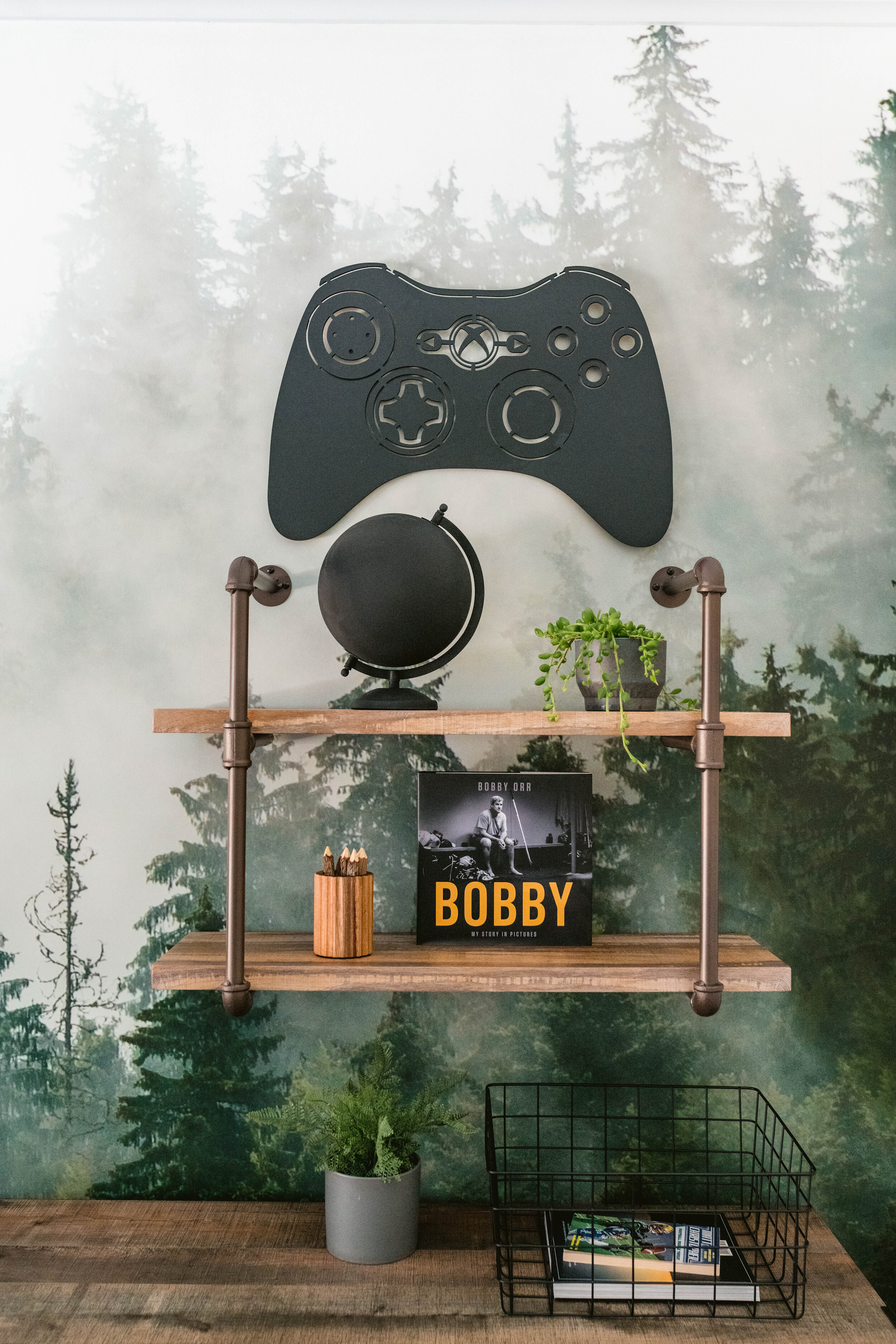
When it comes to kid spaces, it’s important to sprinkle in lots of decor that is personal and brings true joy. And isn’t expensive because taste and hobbies change quickly and often. Here we added nods to our clients love of hockey and video games throughout the room with art, a functional hook rack and a video game controller wall decor (that has LED lights and is controlled by remote!). How meta…a remote control that is controlled by remote. Mind blown.
It was really important to us to add a sitting area to the room. This is a key function difference between the toddler/little kid bedroom and the tween/teen bedroom. A spot to hang with a friend and a seat that isn’t the bed is a must. This tufted, leather, slipper chair is the coolest and we added the pouf for a surface/foot rest/extra seat. The accent table doubles as a surface for the person in the chair and a minimal nightstand.
When it comes to smaller rooms - and this a relatively small room - it’s important to use multi-functional furniture. Like the pouf and the accent table, the dresser is also taking on two roles. Of course it’s essential clothing storage, but it’s also a nightstand.
We loved adding the floating pipe shelf because you can still see the mural and it’s an opportunity for a bit more decor (read = personality). Don’t be scared of layering art or shelves or wall decor on top of your wallpaper. You don’t want to completely hide the wow moment, but layers of any kind add interest.
We kept the bedding simple because we didn’t want to compete with the foggy forest. This is a great time to point out that most rooms need only one focal point. Everything else is a supporting actor. With the wallpaper being the star, we were sure to keep other areas of the room a bit quieter. Had we simply painted the wall, we may have chosen and loud, colorful, interesting bedding scene.
similar euro pillow / similar lumbar pillow
However, supporting actor roles don’t have to be boring. People win Oscars for supporting roles. Which brings us to the rug. It has a pared down version of the room’s color palette (white and gray), but the bold pattern and modern fringe make it something special. (Scroll up to see a closeup of the fringe).
We could talk about our projects endlessly. What have we missed? Let us know in the comments. And check out the article in The Globe Magazine for more behind the scenes of this design.
More reveals to come!!!
- Leah
*this post includes affiliate links*
