Greatest Hits - Volume 1
/The post you’ve all been waiting for - details and links for the most requested elements from many of our projects. We’re starting with some recent projects from this summer and going way back to the beginning of Gray Oak. Enjoy.
The Every Day Stuff
We want to kick it off by sharing something that we use in nearly every, single project - a rug pad. We were recently asked on Facebook how we prevent smaller area rugs from slipping and sliding all over the place. A great rug pad is the best solve - something that has thick felt on one side and rubber on the other.
We will always use and support real plants. Nothing better than the real deal. But, we also live in New England where you can’t walk outside year round to grab a fresh clipping from your yard. And it’s not always easy or cost effective to buy fresh greenery from the grocery store every week. So, we found these and we truly love them. And they’re a steal.
Onto the main event…
Hickory Project - 2020
We were so excited to reveal this project over the summer. The dark, moody sitting room hit a note with our followers and the requests for the wall color poured in. We’re happy to share that it’s Midnight Blue by Benjamin Moore.
Stafford Project - 2020
We don’t even have professional photos of this one yet because Install Day was less than a month ago. When we posted a sneak peek of the living room on our Instagram stories, we instantly got dozens of questions about the mirror over the fireplace.
Prospect Project - 2019
We designed a lot of spaces for this amazing family. Starting on the first floor with their dining room, living room, family room, mudroom and powder room.
The Linear Chandelier - There were requests for sources of quite a few things in this project, but the dining room chandelier took the cake. And we get, it’s one of our favorites too.
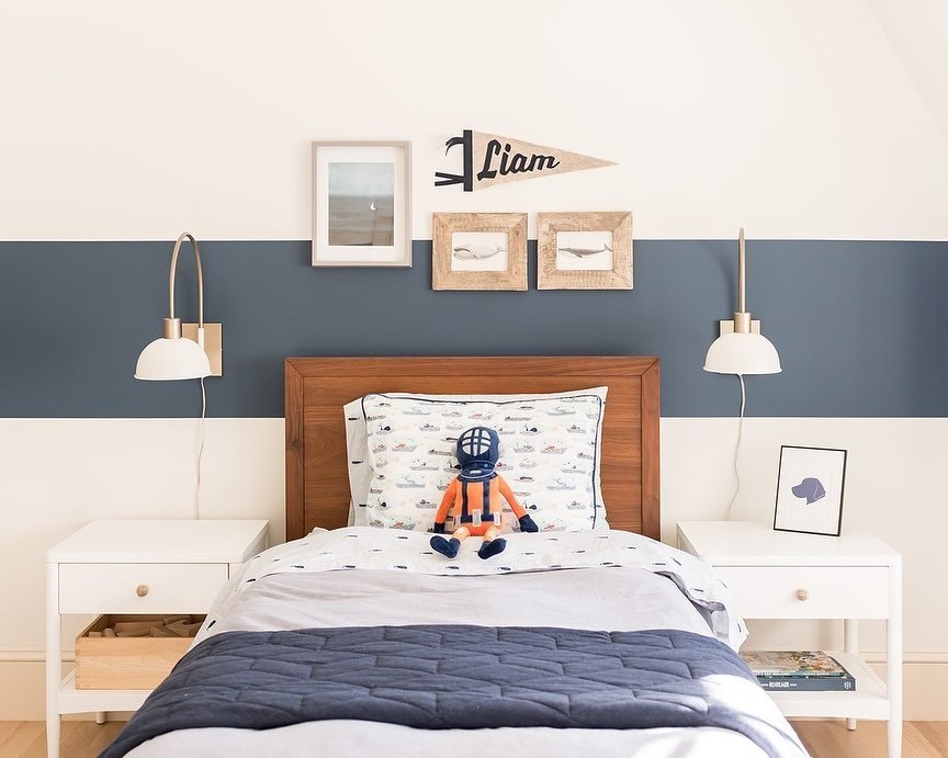
After completing the common rooms of our Prospect Project we worked on a girl’s nursery and a big boy toddler bedroom. The wallpaper in the boy’s bedroom made a big impact in the room and a big impact with our followers. We even had a follower send us a photo of a room she used it in after seeing it in this project! It made us so happy.
Enos Project - 2019
We designed three spaces for this project - living room, family room and dining room. We got endless requests for links to the family room and dining room rugs. Rug source requests are something we get a lot. Understandably so, they’re a costly element of a room and easy to go wrong (by way of size, material or just general look).
Curtis Project - 2019
It was so fun creating a colorful, eclectic bedroom for this client. From the start, she knew she wanted a colorful rug. When we found the rug we used, it was love at first sight. Turns out many people felt that way. It’s 100% wool, it has tassels, it’s awesome.
Lowell Project - 2018
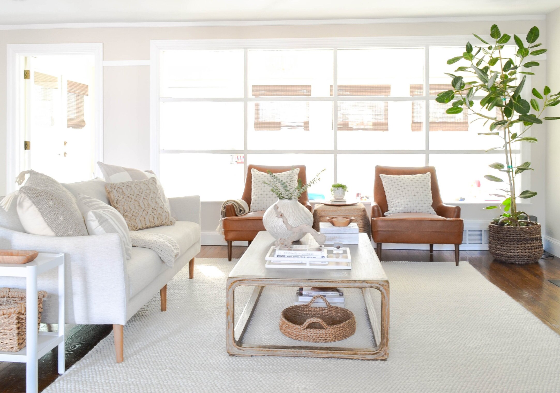
This project stretched our creative muscles because we used almost no color. It was an exercise in texture as we layered neutral on neutral on neutral. Which made it very funny when everyone gravitated toward the non-neutral (though close) leather chairs. They have a smaller footprint than the average leather chair and a unique sleekness.
Lovell Project - 2018
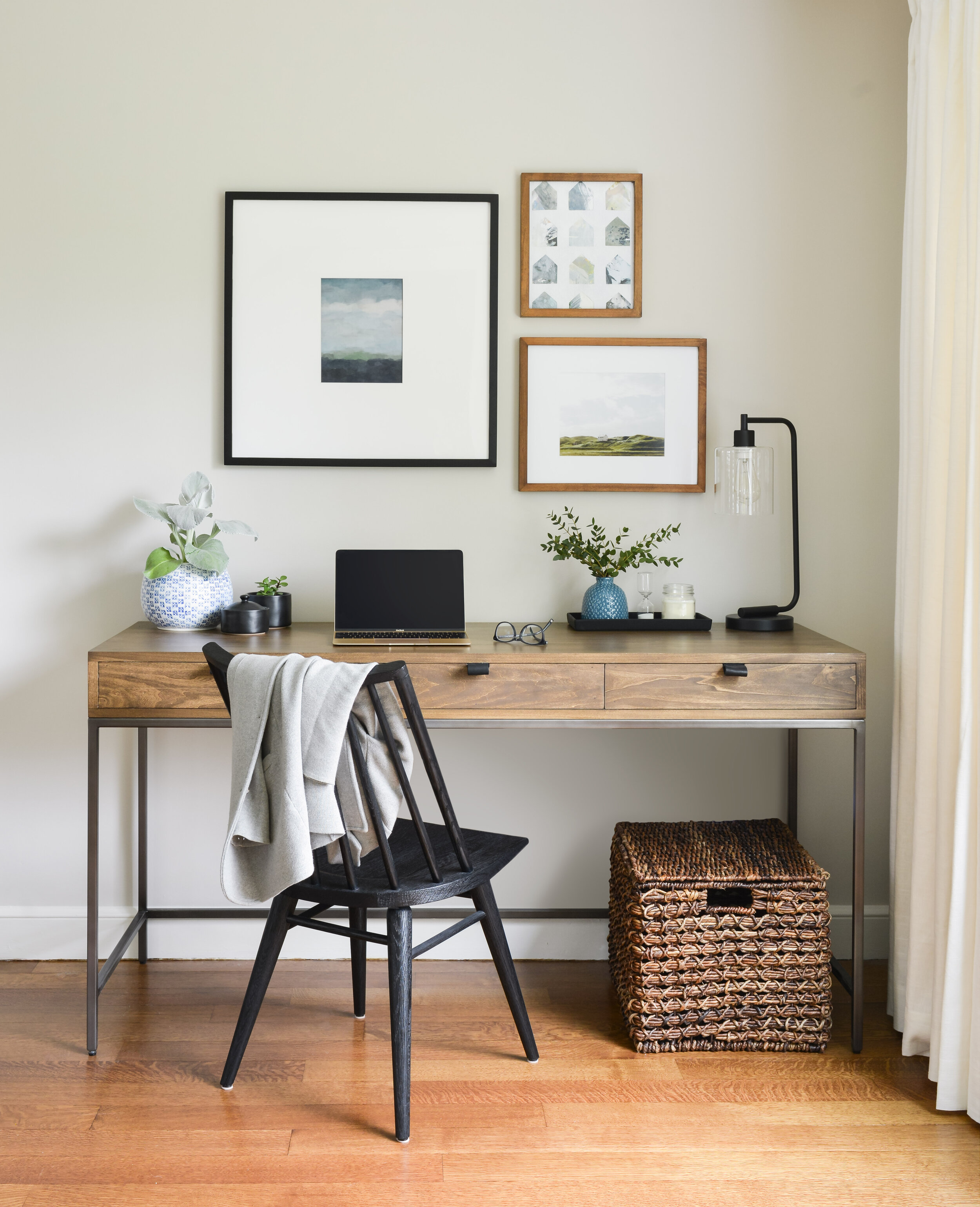
This project has a lot of relevancy to the current state of the world - we were tasked with designing a living room that included a work station for the whole family to use. There was a separate office in the home, so it needed to be simple and beautiful and functional for a laptop or writing. The photo below is by far our most popular Instagram image to date based on like/comments/lots of shares (we have our most popular image on Pinterest that is yet to come…).
Windsor Project - 2018
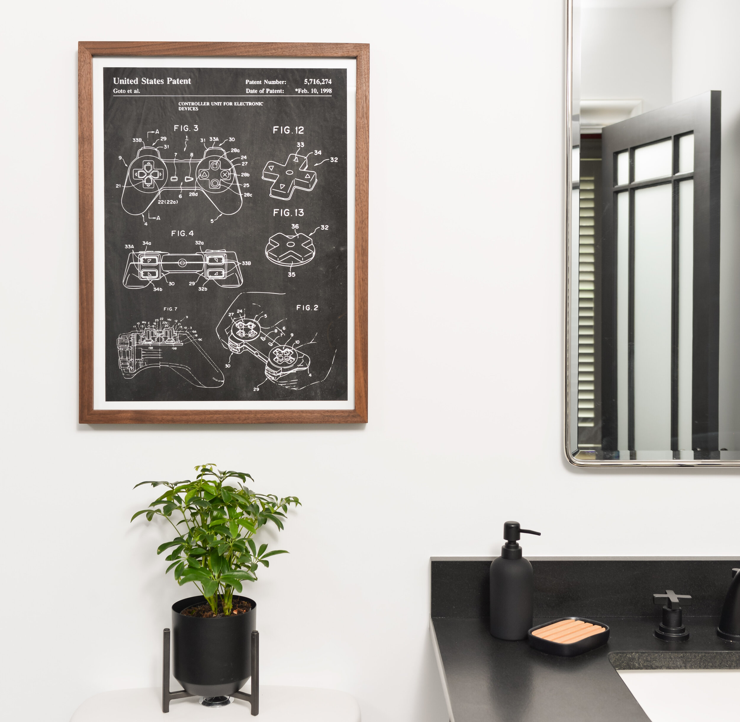
This was a really fun bathroom renovation because our client was a 10-year-old boy. To inject some non-permanent fun into the room, we found a video game controller “blue print” for art above the toilet. We love how it ties in seamlessly with the ageless design.
Hutchins Project - 2018
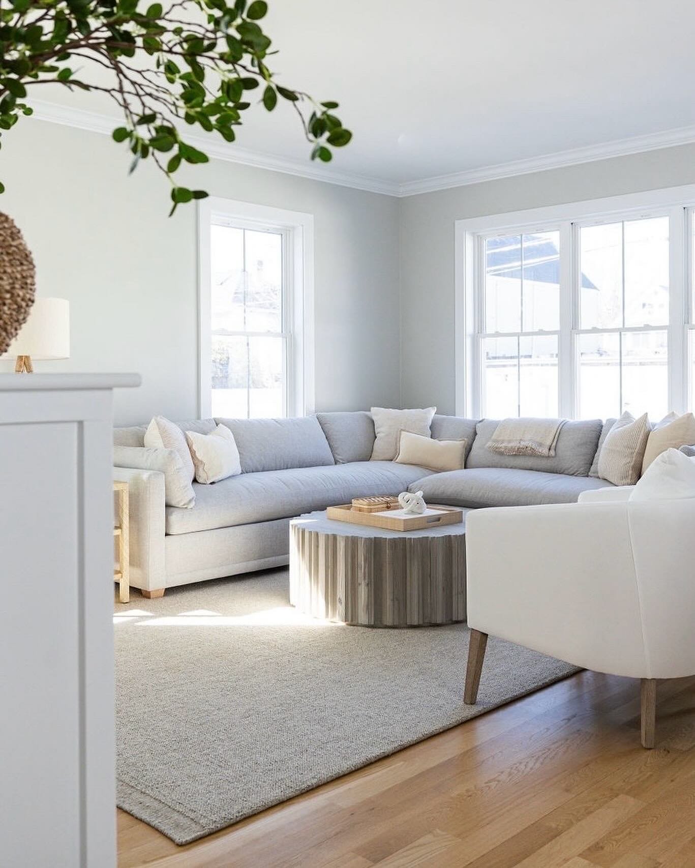
This project takes the cake for our most pinned image (bar none) and the most coveted piece of furniture: the nubby ottoman in the family room. It’s even better in person. And as a bonus, the wall color in this room is Nimbus by Benjamin Moore (we get asked about that a ton too).
The Nubby Ottoman - We used the natural wool color, but it also comes in gray.
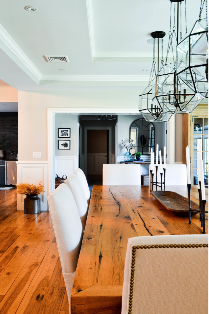
Windsor Project 2017
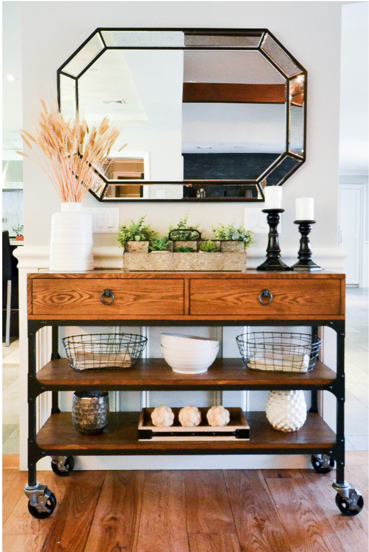
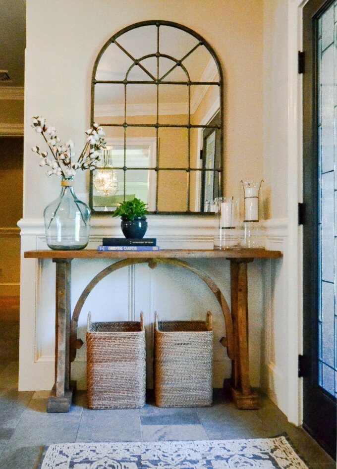
This was our first phase with these clients. We designed a family room, dining room and foyer. The overall aesthetic was a mashup of farmhouse and transitional. The elegant (versus rustic) side of farmhouse. Three years later, we still get requests for the the source of the foyer console table with the arch detail.
We hope you enjoyed walking down memory lane with us. There are a lot of projects we didn’t cover (Dover, Tappan and Pearl) and there may be elements of these projects that are your personal favorite that we didn’t cover. SO…let us know what you loved most. There will be a volume two. Promise.
- Leah
*this post contains affiliate links*
