Hutchins Project - Living Room Reveal
/It’s been a long while since I’ve written a project reveal post, so I apologize if I’m a little rusty.
Today, I’m breaking down a family room we installed in December for our Hutchins Project. First order of business: is there a difference between a family room and a living room? Not really, but kind of. They’re mostly synonyms. Both terms conjure ideas of a sofa, a coffee table and a media center with a television. A family room is just a bit less formal than a living room. In fact, a family room is sometimes referred to as an “informal living room” in architectural plans. In designing a family room, we focus on creating a space that can be enjoyed by all family members and we take special considerations for the wee ones.
With the (little) kid-friendly factor in mind, we designed this family room with lots of soft corners and lots of storage, but still incorporated all the elevated touches and beautiful details that make it feel polished. It’s sort of like the dress that goes seamlessly from day to night.
For this project, we were asked to incorporate the existing sofa, armchair, rug and media center - all the large furniture. In this regard, this room was not a typical project for us. But, we love a good challenge.
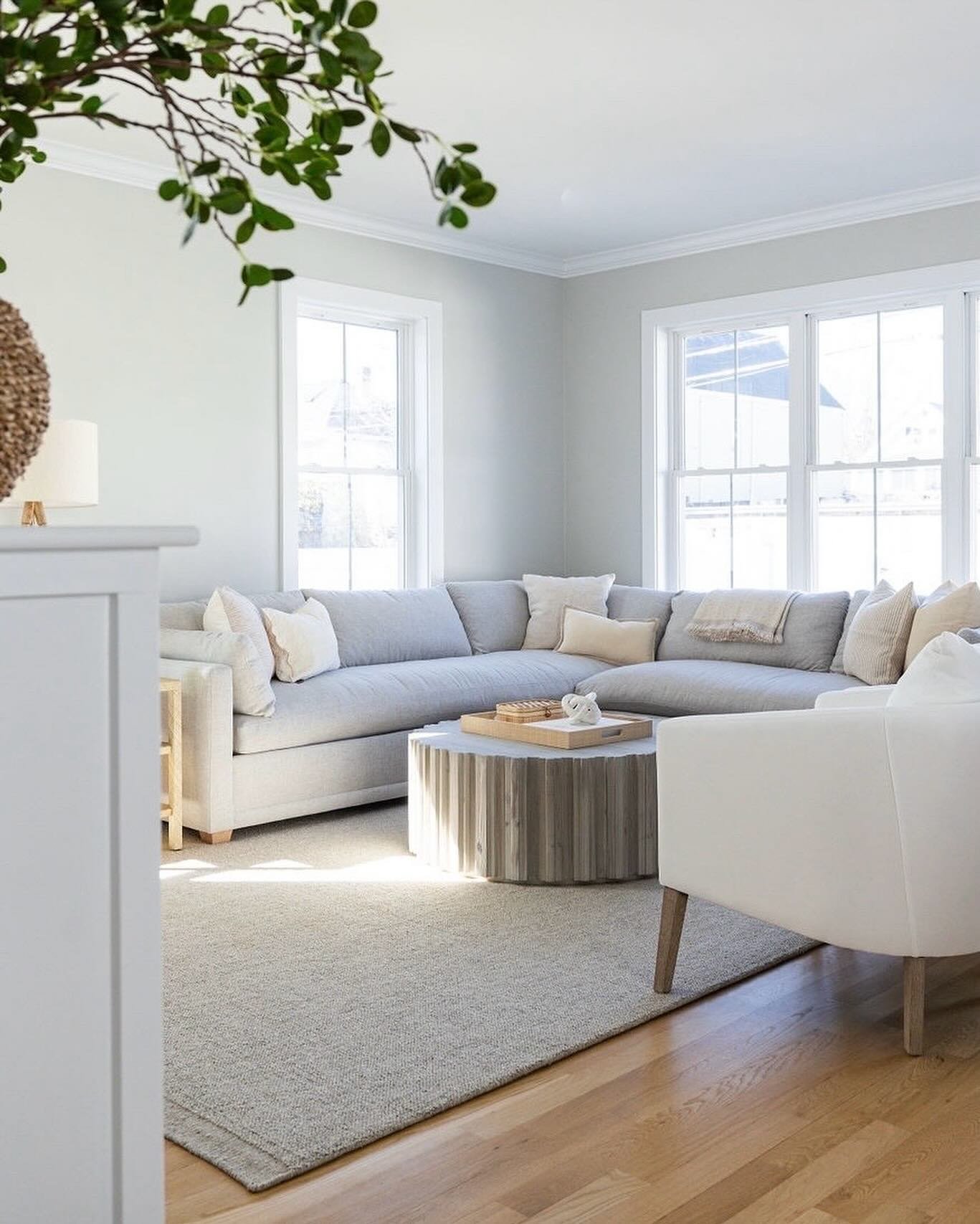
Before we even considered the elements we would need to bring into the room, we changed the layout. The sofa and armchair were originally next to each other, both facing the media console. We shifted the armchair to the opposite side of the room to create seating more conducive to conversation (without detracting from TV viewing angles!).
{Design Tip}: Perpendicular seating, versus caddy-cornered seating, is best for conversation because no one is craning their neck, and, the right angles created by the furniture arms are modern and clean.
Unfortunately, we forgot to take a true “before” photo because during our initial meeting with these sweet clients we moved the armchair immediately after shaking their hands and introducing ourselves. “Hi, I’m Sonia.” “Hi, I’m Leah.” Awkwardly long pause as we make eye contact, know exactly what needs to be done, quickly consider if it’s too soon to start moving their furniture, then ask even though it definitely is too soon, “Would you mind if we moved your armchair? It’ll just take a sec…”
In the “before” photo below, we had already shifted the armchair. So just imagine the armchair next to the sofa, also facing the television, on the side closer to the camera (not the window side).
After (immediately) tackling the layout, we dove into the design. With this being a family room we had a few goals in mind: storage, comfort and beauty. We added storage with two floor baskets and four baskets in the media console. We envisioned the floor baskets as catch-alls for random toys that sneak out of the playroom. Pop a snuggly blanket over said random toys and the clutter is hidden for guests or for your own sanity.
In addition to creating storage, the baskets in the media console were also great for creating a more simple, clean visual that doesn’t compete with the television. Because when you’re watching Trolls for the 157th time, you need to be able to focus. I kid. But truly, styling open shelves around a television is a different ball game than styling a bookcase.
A media console is already filled with the TV, cable box, stereo equipment and some other necessary uglies. Keeping the surrounding decor simple will create visual comfort in this naturally busy element of the room. Using a simple color palette and larger decor is key. Here, we switched out the silver knobs for matte black, and kept the palette to brown (woven baskets and wood vases), blue and white. The greenery is our only true color. For decor, we repeated just a few items: baskets, books and vases/planters.
The cozy factor was met and exceeded with two overstuffed, wool ottomans. They have fabulous texture that is great for kicking up your feet or launching off onto the sofa superman style. Throw pillows and blankets also added to the cozy vibe while remaining functional for all that impending fort building. And the long, linen curtains added to a comfortable, inviting feel of the room.
At last - how did we make it pretty? We started with a fresh coat of paint on the walls - Nimbus by Benjamin Moore. We also added a beautiful (and textural…cozy vibe) light fixture and two lamps. The addition of any type lighting is an opportunity for beauty and function. Finally, we created “movable” vignettes. These were pretty little nooks and crannies that made the room feel polished, but could be removed and easily hidden away when fort building is underway. For example - All the smaller decor (vases and books) on the tray on the ottoman can be relocated to another surface or hidden in a media console basket without much work.
Here is a side-by-side of before (left) and after (right). LOVE seeing the full impact of each design element brought together is one awesome transformation.
If you’re interested in reading other client project reveals - click here. And, otherwise, until next week!
- Leah


