Homestead Entryway Reveal
/Today we have a fun, little reveal for you. You may remember the living room and office transformation from Homestead? Today, we're revealing the Homestead entryway. Our design focused on one wall within the entryway - you could say it was more of a refresh. Speaking of refresh, head to our Instagram or Facebook accounts later today to learn who won the Spring Refresh Giveaway!!!
Okay, back to the reveal. If you follow us on social media, you may have see this video way back in December (eek, can't believe that was 3 months ago!).
This is from the Homestead entryway and it's our favorite method for creating a gallery wall. We cut pieces of paper in the size of each frame/mirror/decor and hang everything in place with painter's tape before we starting nailing. It's one thing to look at your gallery on the floor and another to look at it on the wall. This method also helps when it comes to hanging everything up. We mark where the nail should go on the paper. We've found this method to be easier and more accurate than measuring.
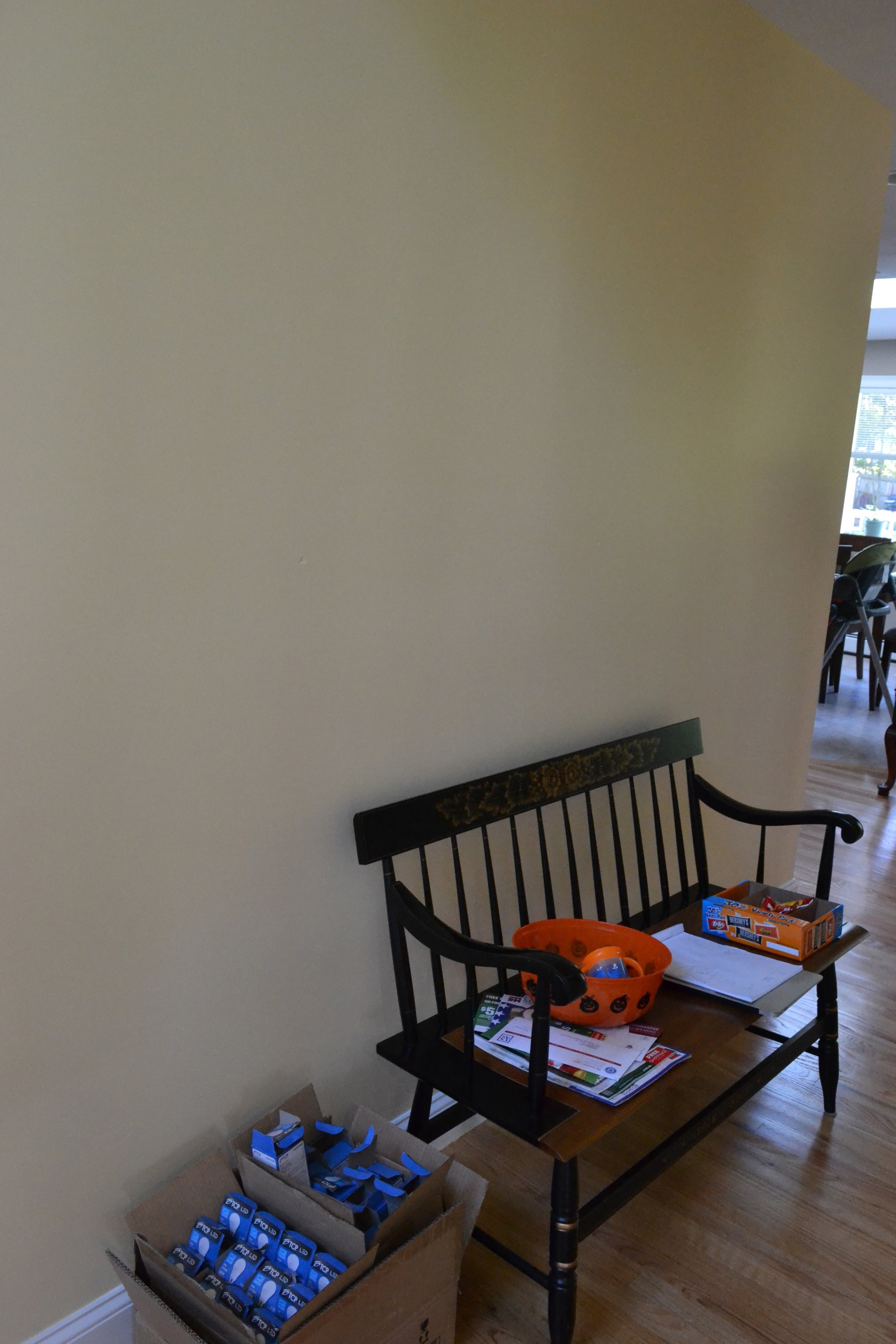
Here is what the space...really the wall...looked like before.
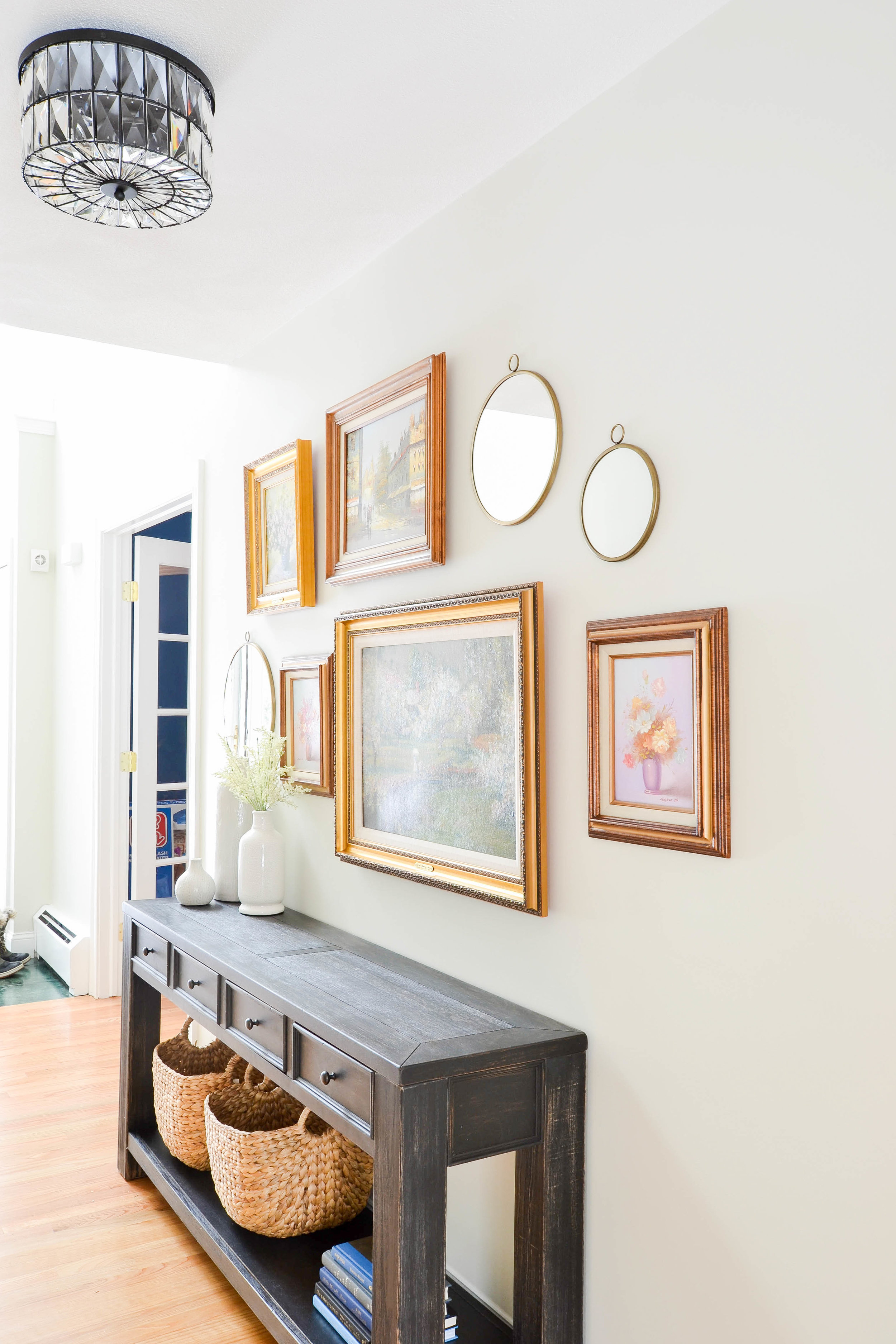
And here's what it looks like now.
Our tried and true entryway formula is texture + mirror + storage = success. And, yes, of course we applied it here. We painted the walls, changed the light fixture, created a gallery wall and replaced the bench with a console table (you may recognize this console table from our Pilgrim Project), making sure to incorporate texture, a mirror (in this case 3) and storage.
Painting the walls had a huge impact. This color is November Rain by Benjamin Moore. It's a really soft, subtle gray that works well with beige tones.
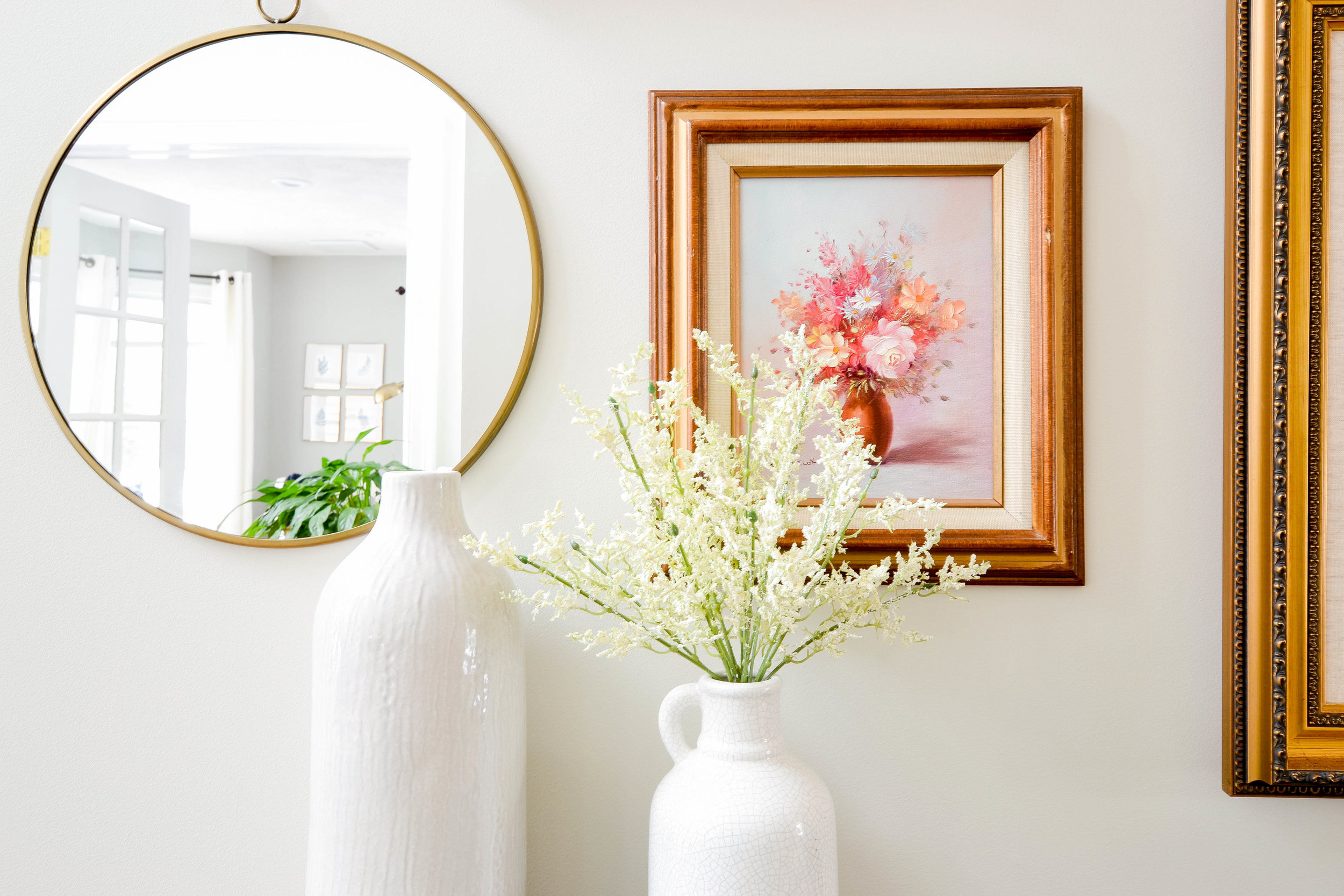
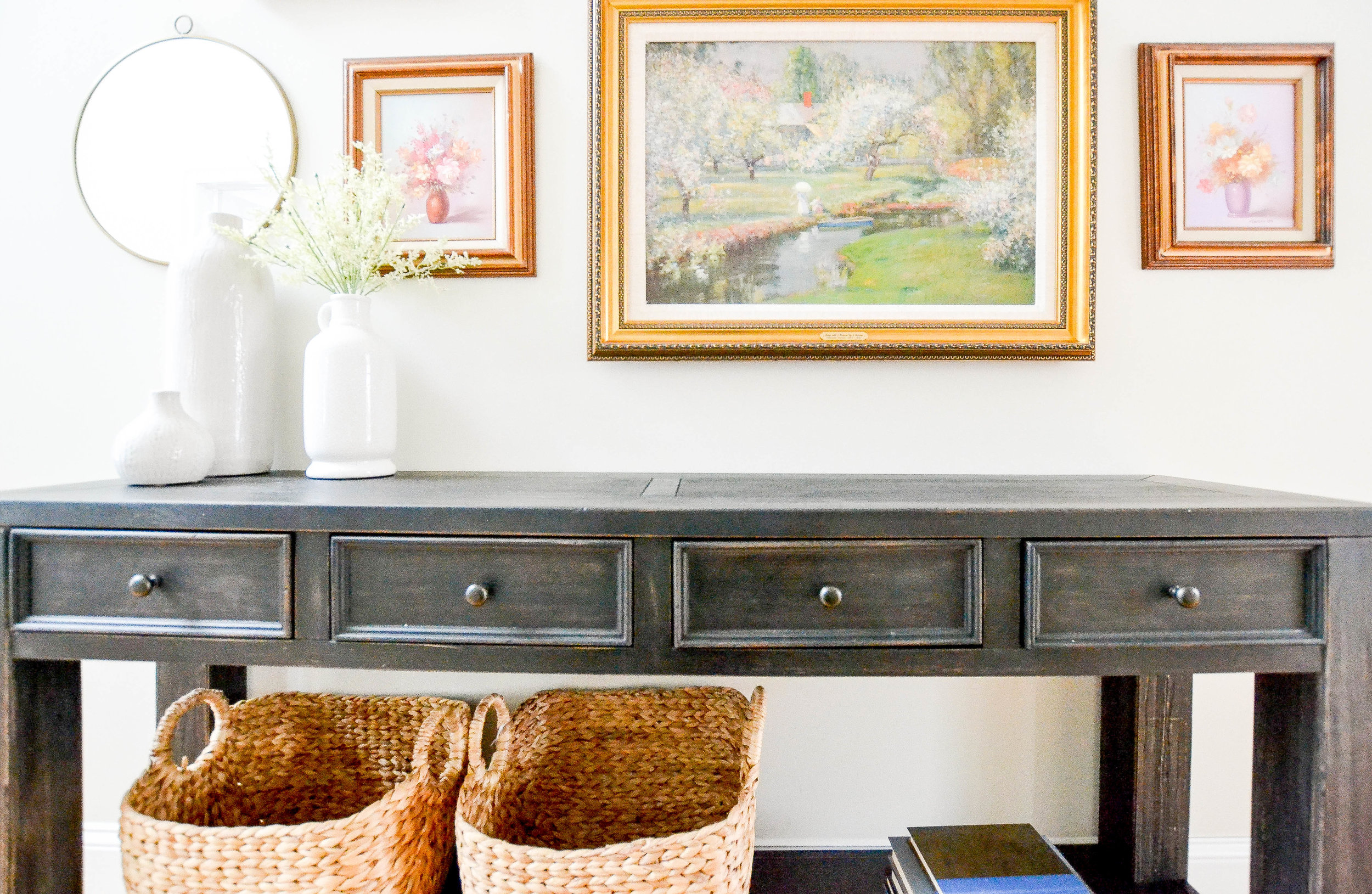
The gallery wall was a fun puzzle, as all gallery walls are. The gorgeous oil paintings in their vintage gold frames are owned by our client. She let us go through her collection and pick the few we wanted to include. We love how the set of round brass mirrors contrast the shape of the frames and their style - the frames are ornate and vintage, the mirrors are simple and modern.
{Design Tip}: We love using Command Velcro Strips to hang unusual wall decor. These round mirrors don't have hardware on the back to hang them. No prob. We slapped on some velcro strips and problem solved. Be sure to check the weight of the item you're hanging and the weight limit of the strip you're using.
Like the gallery wall, the color palette is also both vintage and modern. Nothing like black, white and gold.
We added texture with faux flowers, which can be replaced with fresh flowers or different seasonal stems.
The baskets on the bottom shelf of the console table add more texture and more hidden storage. Double whammy.
And here's a side-by-side Before and After shot.
Little space, big transformation.
Next week we have another interview with a BIG TIME designer. Happy Monday and have a great week.
- Leah, Sonia & Michele
*This post contains affiliate links*
