Geometric Kid's Art Space
/It's our first blog post and our first completed project!!! I promise not to over punctuate going forward, but this is kind of a big deal.
Before we dive into the details of this incredibly fun project, Sonia, Michele and I want to say we are very excited, bordering on a gleeful freak out, to share our passion for home design - not just in our portfolio, or in your home (call us!), but also here on the blog where we will dive deeper into our creative process and, dare I say, get personal. Because your home is personal. Ideally, it's the sum of what makes you happy. Our goal on this blog is to inspire you, entertain you, and, mostly, help you create a happy home.
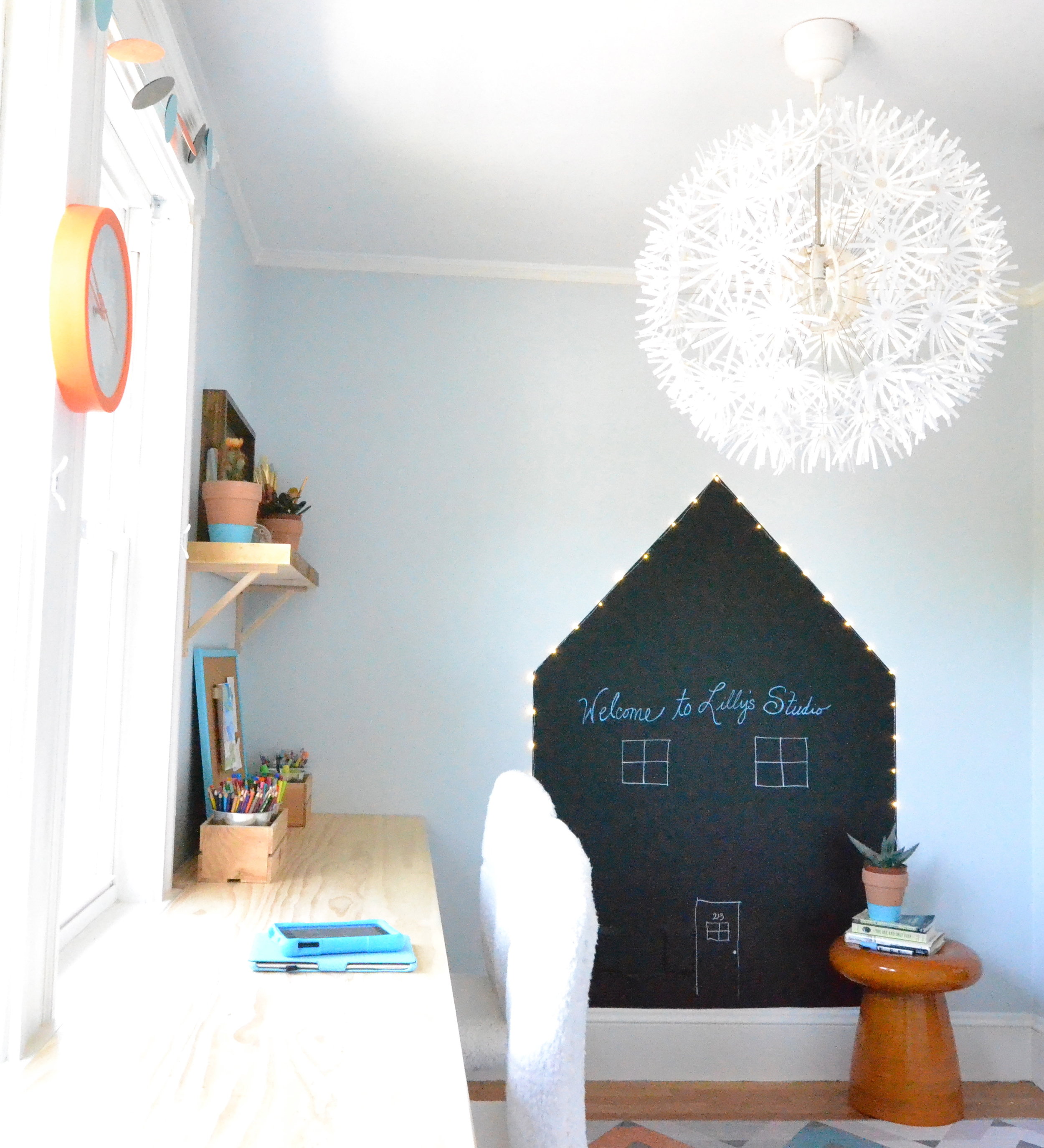
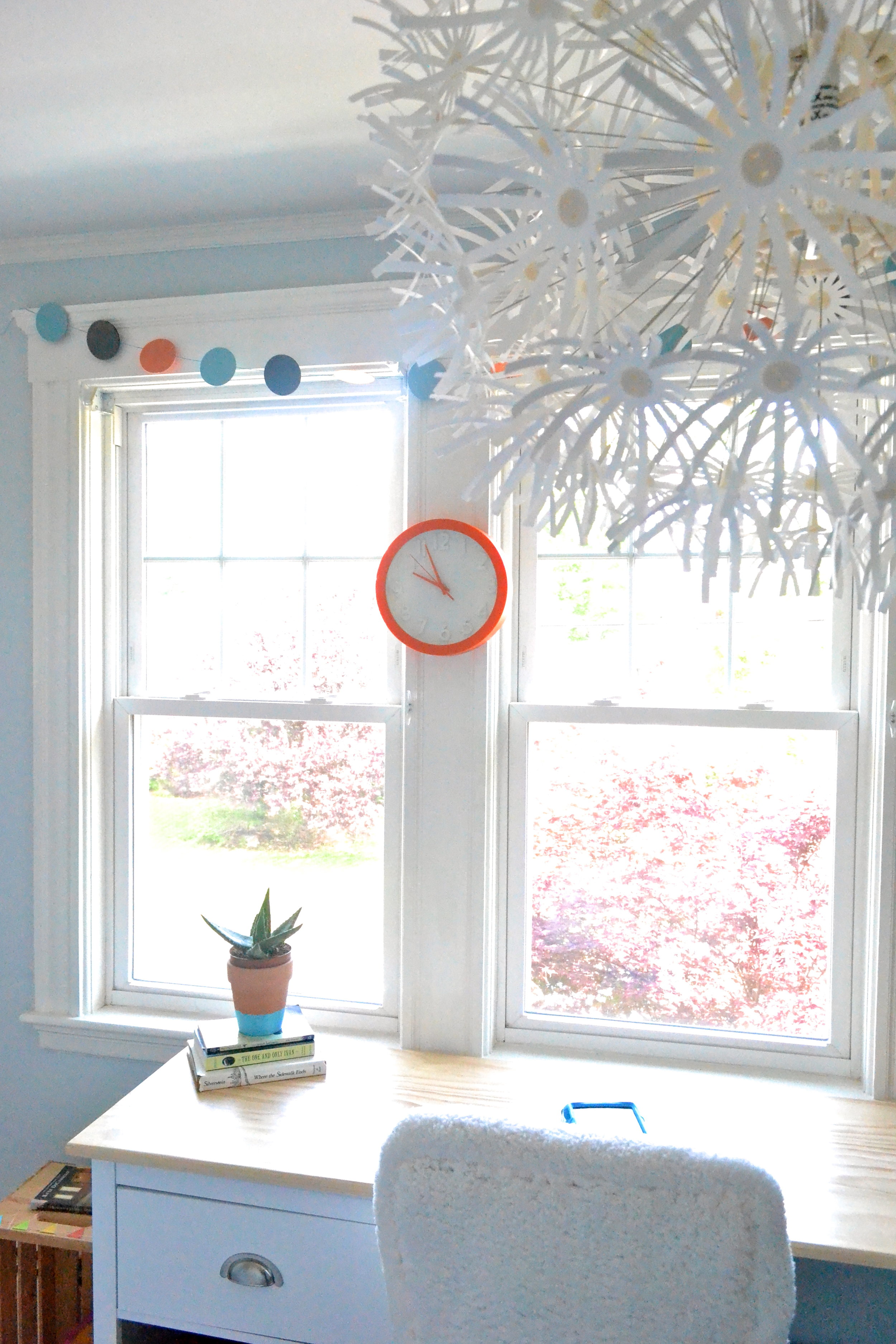
Speaking of happy, this project is happy from top to bottom - from the turquoise and orange color palette to the variety of furry furnishings to the oversized flower pendant light.
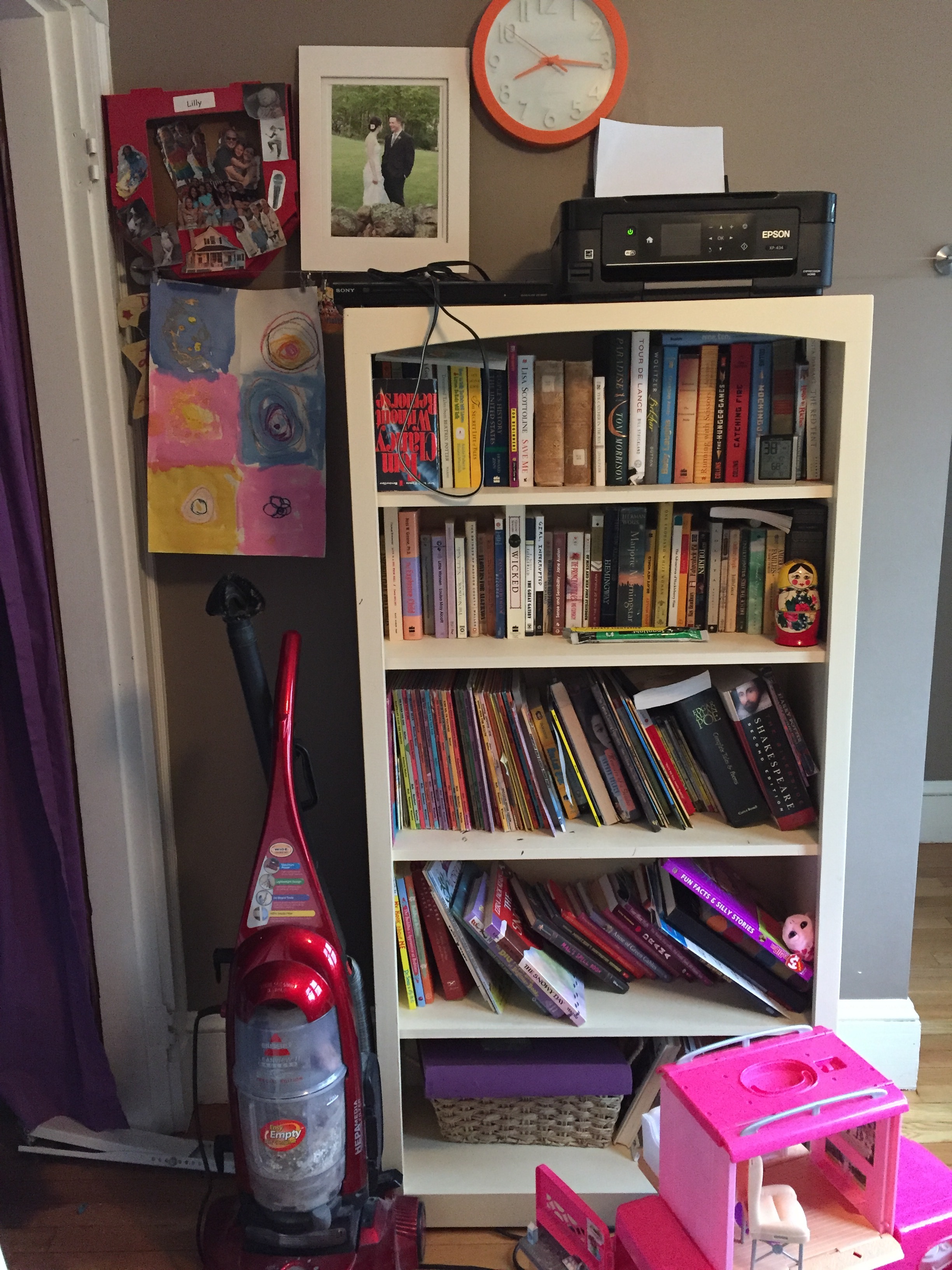
But let's back up. Here is what the room looked life before.
The family had a clear vision of what this room should be - a space for 8-year-old Lilly to do her homework, create art, build Magnatile masterpieces and maybe do a little yoga (Lilly loves yoga). But, after renovating and designing every other room in their home, they lost steam. As you can see in these "before" pics, the wall color was a sad shade of brown and it lacked the inspirational vibe necessary for a creative space.
That's when we came in. We talked to Lilly's parents and, of course, we talked to Lilly. Our mission was clear: reclaim the space as a creative hangout for Lilly and don't use girly colors.
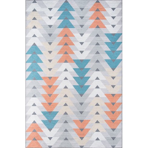
Like many designs, the inspiration for this room centered on one key element and grew. Here she is - the rug. We love the color combination and the geometric pattern. It's youthful, but mature enough to grow with Lilly. It's close to neutral without being boring. It's free of overtly feminine colors.
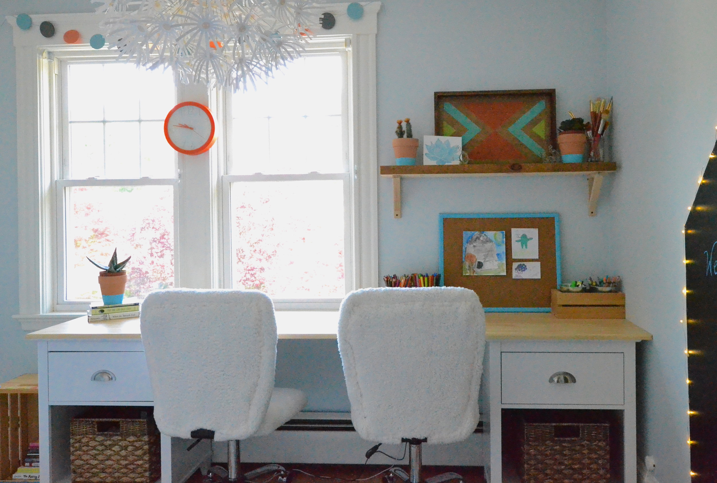
With the aesthetic part of our design rolling, our next focus was the room's function. We needed a desk and we wanted a desk big enough for two people. While we designed the room for one Lilly, we knew she would share her space with parents and collaborating with friends. In came Lilly's grandfather, who makes custom wood furnishings.
We designed this gorgeous, extra long desk (it's 8 feet) and Lilly's grandfather helped us build it. The base of the desk are matching end tables that feature some hidden storage and some open storage, the best of both worlds. Lilly's grandfather custom built the top, which we finished with a satin polyurethane and steel wool to keep as matte as possible. The finished product fits perfectly around the window moulding and comfortably seats two creative minds.
During our meeting with Lilly, she also specified that things needed to feel cool - she wanted texture. With only a few other significant furnishings for the room, we decided to go big with fuzzy white desk chairs. We also brought in a large, square, furry ottoman. It's actually a cross between an ottoman and a floor pillow and it's the perfect size for Lilly to cuddle up and read a book.
Almost all the wall decor is temporary. It's designed to be removed and replaced as Lilly's interests and style evolves. We were also dealing with an old New England home with walls made of horsehair plaster. Yes, you read that correctly. This was common practice back in the day...way back in the day. Nailing into horsehair plaster can cause a host of issues, so rather than open that can of worms we all agreed that surface mounting was the best choice. To make this happen we used a combination of velcro, washi tape and glue dots.
The framed art is velcroed to the wall. We used stick-on velcro - one side stuck to the wall, the other side stuck to the frame. Washi tape was used for smaller photos mounted on craft paper and glue dots were used to secure LED lights around a house shaped chalkboard. Speaking of, the chalkboard house is made of adhesive chalkboard paper that we cut into the shape of a house.
The last detail in this room we want to point out is the light fixture. Some of you may recognize it as a staple IKEA piece...because it is. It's huge and whimsical, but it's also 100% white which keeps the impact from turning that toooooo-much!!! corner.
We are so pleased with the end result and, more importantly, Lilly is over the moon. For more photos of this complete project, head to our Portfolio.
SOURCE LIST
Wall color - Benjamin Moore Iceberg
Rug - Wayfair
Furry square pouf - Restoration Hardware Teen
Desk chairs - Wayfair
Pendant light - IKEA
Nightstands (base of desk) - Target
Baskets - Target
Chalkboard wall - Amazon (we cut into shape of house)
Patterned Tray - HomeGoods
Air plants - TJMaxx
Terracotta pots - Target dollar section!!! (we painted the turquoise stripe)
LED twinkle lights - TJMaxx
Velcro hanging kit - Amazon
Washi tape kit - Amazon
Glue dots - Amazon
That's all for now!
- Leah
*This post contains affiliate links*
