Mayberry Project Reveal
/The Mayberry Project was so fun and so different from anything we've undertaken thus far. Our mission, which we clearly accepted, was to design a home office for an art loving, sports memorabilia collecting man. Our client, however, was not this intriguing man - it was his wife! The office makeover was a holiday gift. We know, HOW COOL.
It was really exciting (and nerve wracking) to design a space for someone who didn't give us direct input on the project. The entire design was based on meetings with his wife and on his incredible collections. The result is moody and masculine with a strong balance of vintage and modern.
The desk chair is the only thing that remains from "before". We brought in everything else, with the exception of some truly amazing collectors items. We also picked the wall color (yes, that's Hale Navy by Benjamin Moore) and designed the lighting, which includes 4 recessed lights and 2 sconces.
Nearly all of our designs begin with a room layout plan. Layout dictates the type of furniture needed and we don't want to get ourselves into a situation where we fall IN LOVE with a piece of furniture that won't ultimately fit within the space (aka interior design heart break).
Typically, we love a desk that faces a window - it's proper feng shui and, we believe, it truly creates a happier mood and better work productivity. But this office, like many, didn't allow for it. The ceiling of the room has a deep slant on the window side. We didn't want our client cracking his head every time he stood. That's the opposite of a happy mood and productive work environment.
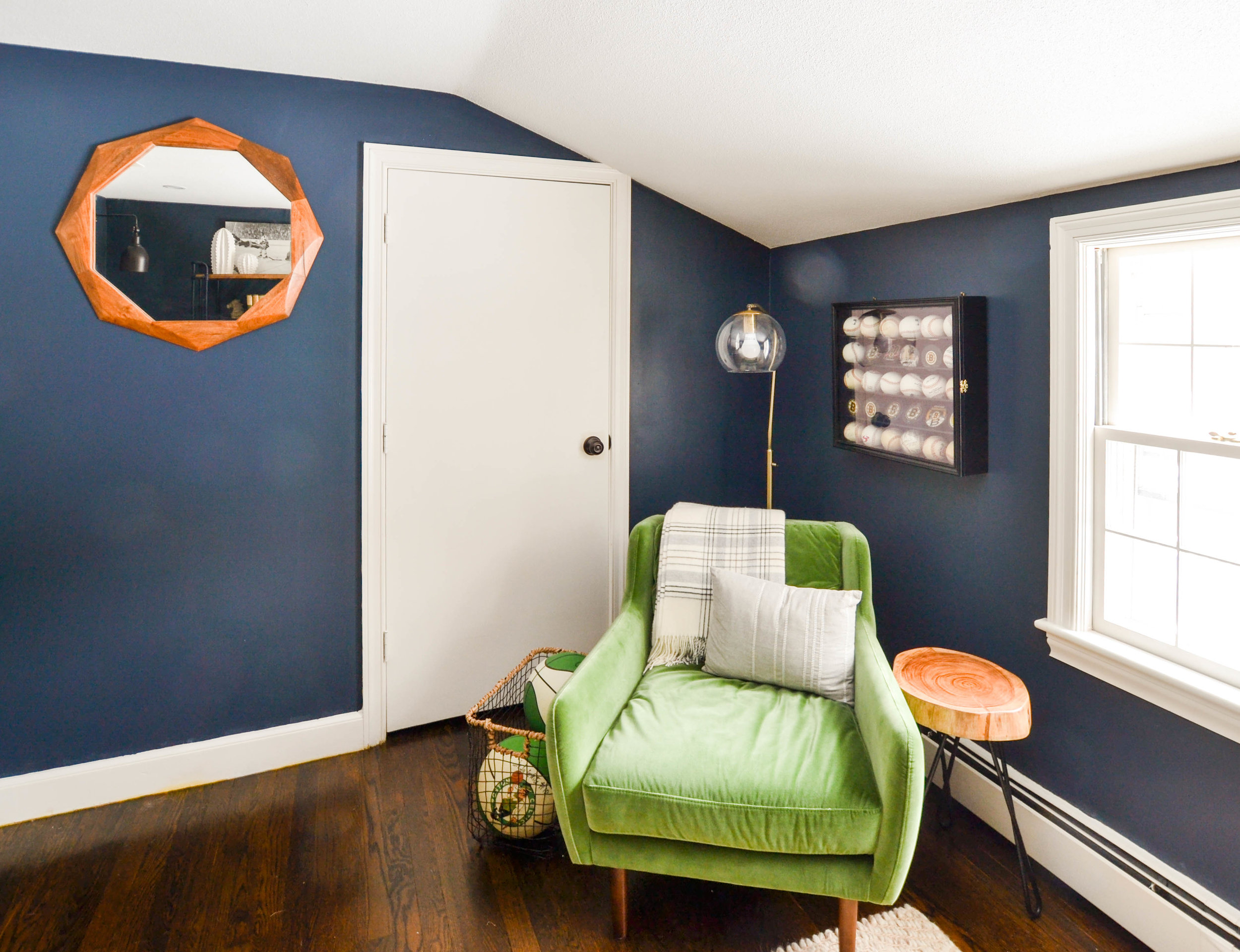
Check out the ceiling slant (and the best green chair ever).
The room is also too small to float a full size desk in its center - we would have lost nearly all the real estate. So, instead, we faced the desk toward a wall where the ceiling height provided maximum head clearance. And, we used some of our client's favorite landscape art as a focal point. {Design Tip} When a desk can't face a window, use nature art or a mirror to create a similar feel.
We chose an art ledge, rather than a gallery wall because we wanted our client to be free to change pieces as he accumulates new favorites or simply because he wants a new view. An art ledge is also a bit less busy than a gallery wall and we didn't want competition with the nearby open shelf bookcases.
Where the ceiling slanted, we created a cozy reading/pondering/coffee and/or whiskey drinking nook. This fantastic green chair has a low stature, which perfect for the low ceiling.
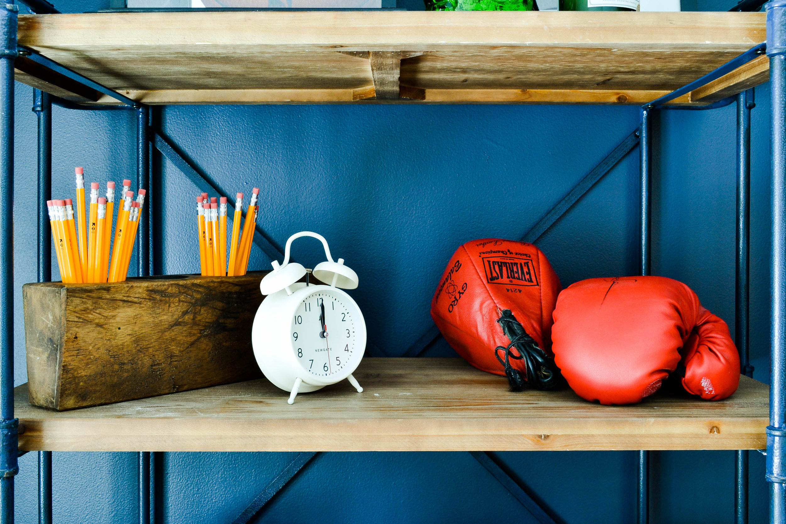
On the opposite wall, we added open shelving for storage and to display some of the amazing memorabilia in our client husband's collection.
The overall feel of this office is modern with some industrial and rustic moments. The lines of the furniture are clean and simple. Yet, the memorabilia is wonderfully vintage, as is some of the decor we added. We love mixing old and new - juxtaposition makes us do a happy dance, which we will never publicly display, so don't ask.
{Design Tip} When your budget doesn't allow for a built-in storage unit or a large scale storage piece, use two matching bookshelves side-by-side to create a similar feel.
How amazing are the signed Wheaties boxes?
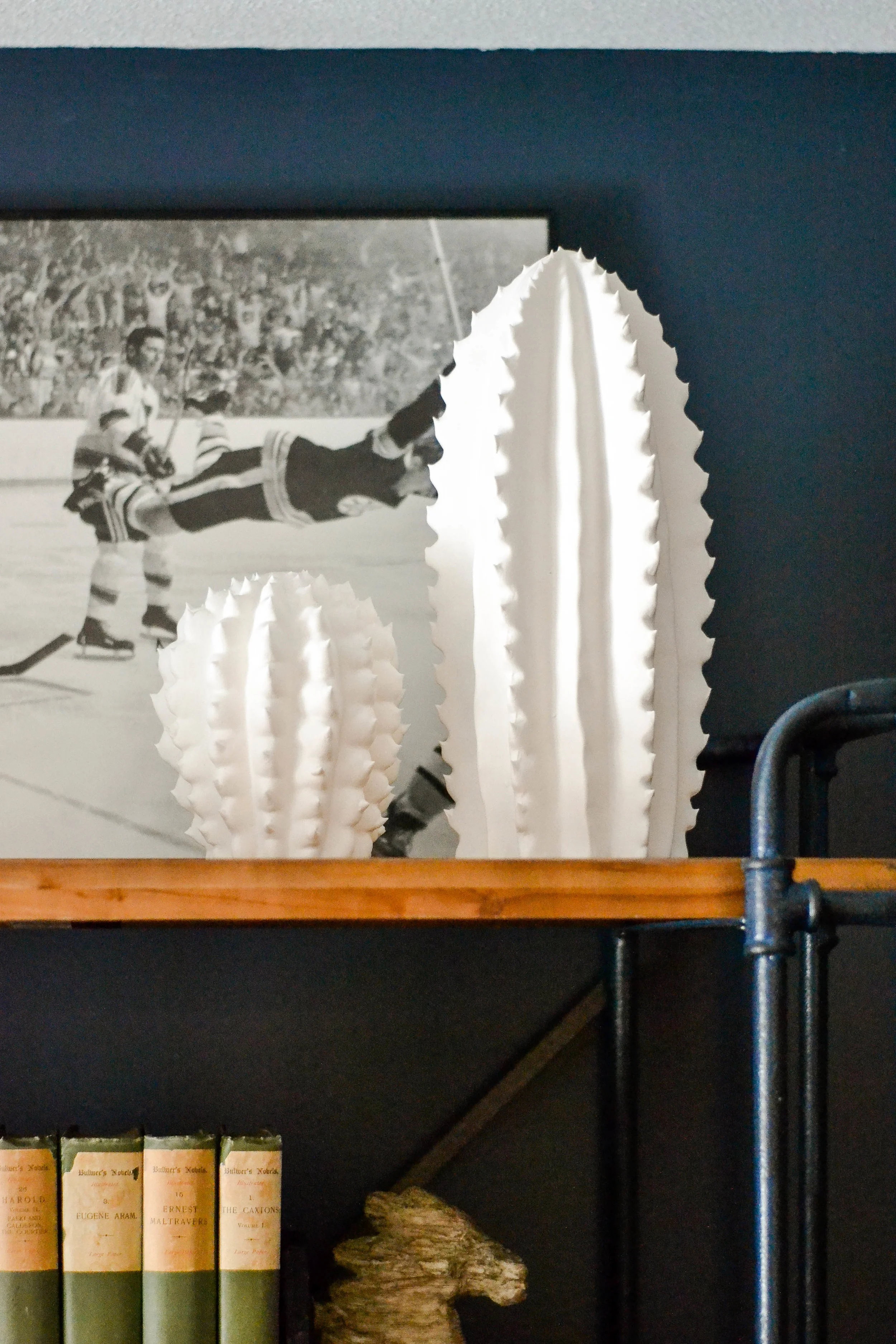
And the ceramic cacti!
Interesting mention about these bookshelves: the metal pipe frame is blue. Unexpected and awesome. The shade is similar to the Hale Navy walls.
No Gray Oak Studio design would be complete without a mirror.
Or greenery. The snake plant (below left) is always a great choice for a room that receives little natural light. The micro plant in the palm (below right) and the ZZ plant (scroll up a bit) are equally low maintenance.
We are readying ourselves for another project with this wonderful client. A new year, a new space.
We hope you enjoyed this room reveal, we certainly enjoyed designing it!
Source List
Desk - Wayfair
Letter sorter (similar) - Anthropologie
Paperclip notecard holder - Anthropologie
Art Ledge - Pottery Barn
Sconces - Wayfair
Bookshelves - Wayfair
Horse bookends - Target
White ceramic fluted planter - Target
Black metal bins - Target
Palm planter - Urban Outfitters
White letter tray (displaying mini gavel) - Target
Clock - Anthropologie
Mirror - Cost Plus World Market
Green armchair - Article
Standing lamp - Target
*This post contains affiliate links*
