April Stay Home - Free Designer for a Day (Vol. 3)
/It’s almost the weekend and the end of Week 5 in quarantine. Is it week 5? Or week 6? or 4? Or…who knows. Let’s just keep on keeping on. Am I right?
Today we’re tackling another window treatment dilemma and a paint color question. These were all submitted as part of our Free Designer for a Day in April. We have been getting all sorts of questions through Instagram, Facebook and a good, old-fashioned email (hello@grayoakstudio.com). It’s still April (I think), so you still have time to submit your question!
Question - I need some help with a specific issue I’m having related to window treatments in my dining room. There are three windows in the room and each one is slightly different in terms of the amount of space I have on each side of the window casings. I’d love to do panels throughout, but I’m not sure it would work on the two side windows, given I’m right up against a wall. (Pictures attached) I’m also not sure if it’s okay to mix Roman shades (side windows) with panels (front window!?) If I AM able to do panels - how would you do it (e.g. thinner panels, only one on each side window, etc.) Would love any advice!!
We worked on a window treatment problem in our first edition of this post series and talked a bunch about why window treatments can be so darn tricky. This is another example of just that - one room, 3 very different windows, what to do?
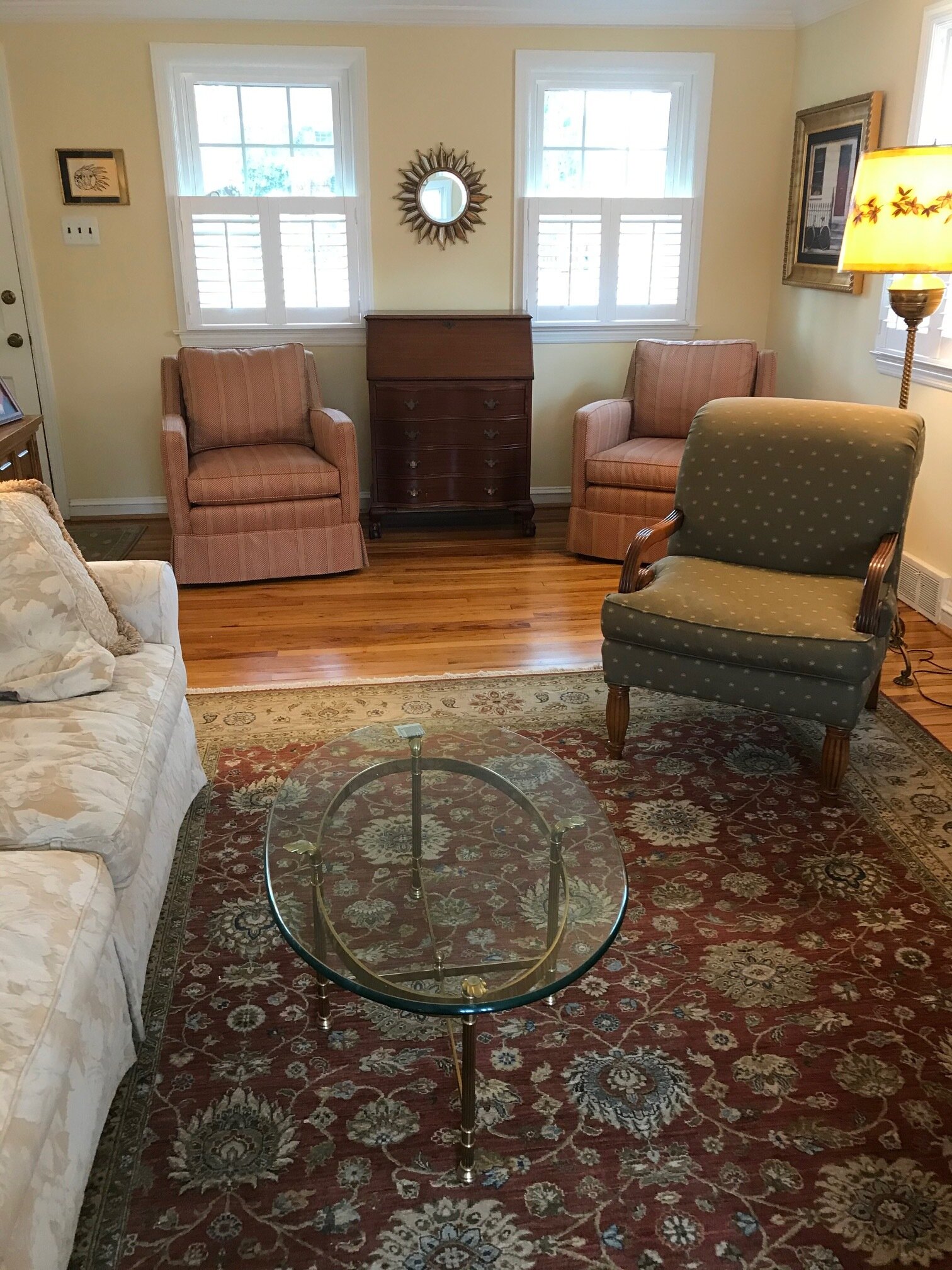
Here is the lay of the land. The two double hung windows flanking the fireplace are on a wall that is perpendicular to the floor to ceiling window.
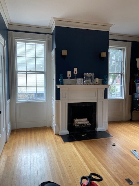

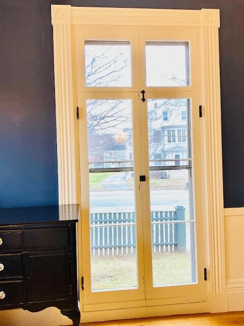
All three windows have different amount of surrounding wall space. And one is a different size.

Window 1

window 2
window 3
Our follower would love to install (drapery) panels on all 3 windows…but we’re gonna suggest (and she already knows this in her heart) that it’s not the best plan. Two reasons. First, one of the pillars of installing drapes is that you go high and wide with the rod to make sure all of the window itself shows when the drapes are fully opened. There’s no way to make that happen on Window 1, even if she uses a super thin panel. Second, this is an amazing historical home with gorgeous (original?) molding. We want to showcase the trim, not hide it.
So, what is the solution? She hinted at it in her question - go with 2 different types of treatments. Drapes for the tall window and roman shades (or nothing) on the windows flanking the fireplace. Mixing window treatments in a room is totally acceptable as long as everything ties together. Here’s a beautiful example.

In our Prospect Project, we used drapes on the windows facing the street and none on the windows facing the side yard.

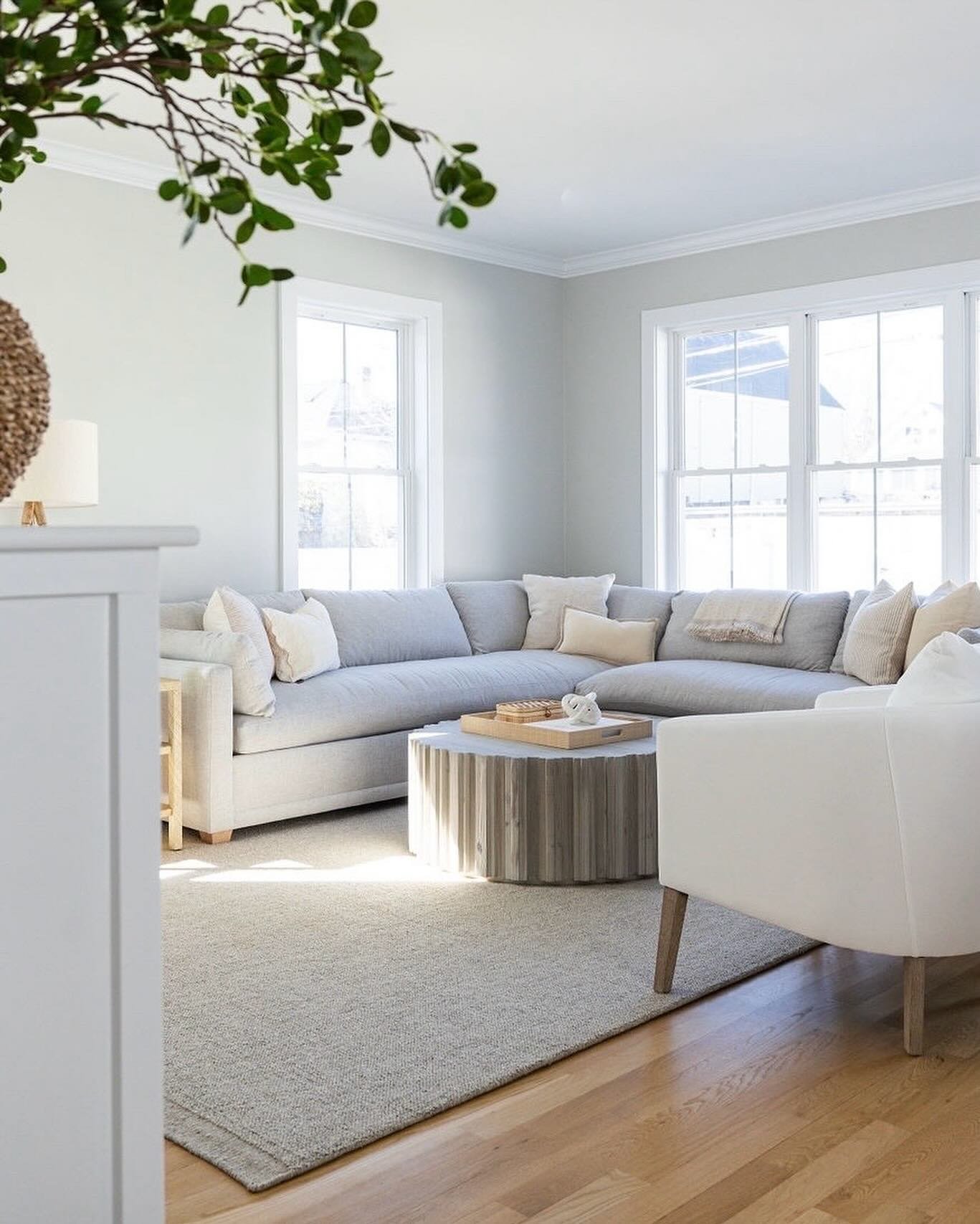
It looks like the dining room in this house is also at the front of the house and there is likely another (possibly similar size) room on the opposite side of a center entrance. We wonder what the window treatment is on the floor-to-ceiling window in that room (…if there is one)? It’s not a hard rule, but it’s nice to match the look of window treatments on street facing windows. The symmetric and uniform look is beautiful and classic. Good curb appeal.
Here is a photo from the other street facing room in our Prospect Project. Again, drapes on the front windows and no drapes on the side windows.

For the tall window, she should hang the drapery rod just below the crown molding and wide enough so that when the drapes are fully opened all of the window shows and (ideally) some/all of the molding. We’re total suckers for drapes in a dining room, and this homeowner clearly wants them, so this is a wonderful spot for them. Quick Note: we get nervous with drapes around radiators…don’t want to encourage any fires. So be cautious and keep the fabric away from the metal!
For the windows flanking the fireplace, she has some considerations. From a functional perspective, it depends how much privacy she wants. If privacy isn’t an issue, no window treatments are needed. From an aesthetic perspective, she might want to add a different color, add visual interest with a pattern or add a soft texture to contrast the architectural details. All are great reasons to bring a window treatment into a room and fabric roman shades will handle the task beautifully. The key will be to unite the treatments on all windows with the same fabric or complimentary fabrics (one fabric for the drapes and one fabric for the roman shades…not 3 different fabrics…don’t get too, too crazy).
One more thing to address: We love plantation shutters in historic homes. Actually, we love plantation shutters in all homes. So, of course, we considered making this recommendation here. But, we don’t know the specific location of these windows or how many windows are in the entire house. Plantation shutters are more of an architectural addition to a home, so it’s important to be thoughtful as to which windows get them and which don’t. Sort of like you wouldn’t put baseboard in just two rooms. Typically all the windows get them or just street facing windows. There is a big picture plan when it comes to shutters.
Question - What are your go to paint colors?
Our “go to” paint colors are…all over the road. The colors we specify vary by the size and shape of the room, the natural light and, most importantly, the feel we want to create. We love using whites and pale grays and beiges.

From hutchins Project (nimbus by Benjamin Moore on the walls)
But, we also love a deep saturated greens and blues and grays.
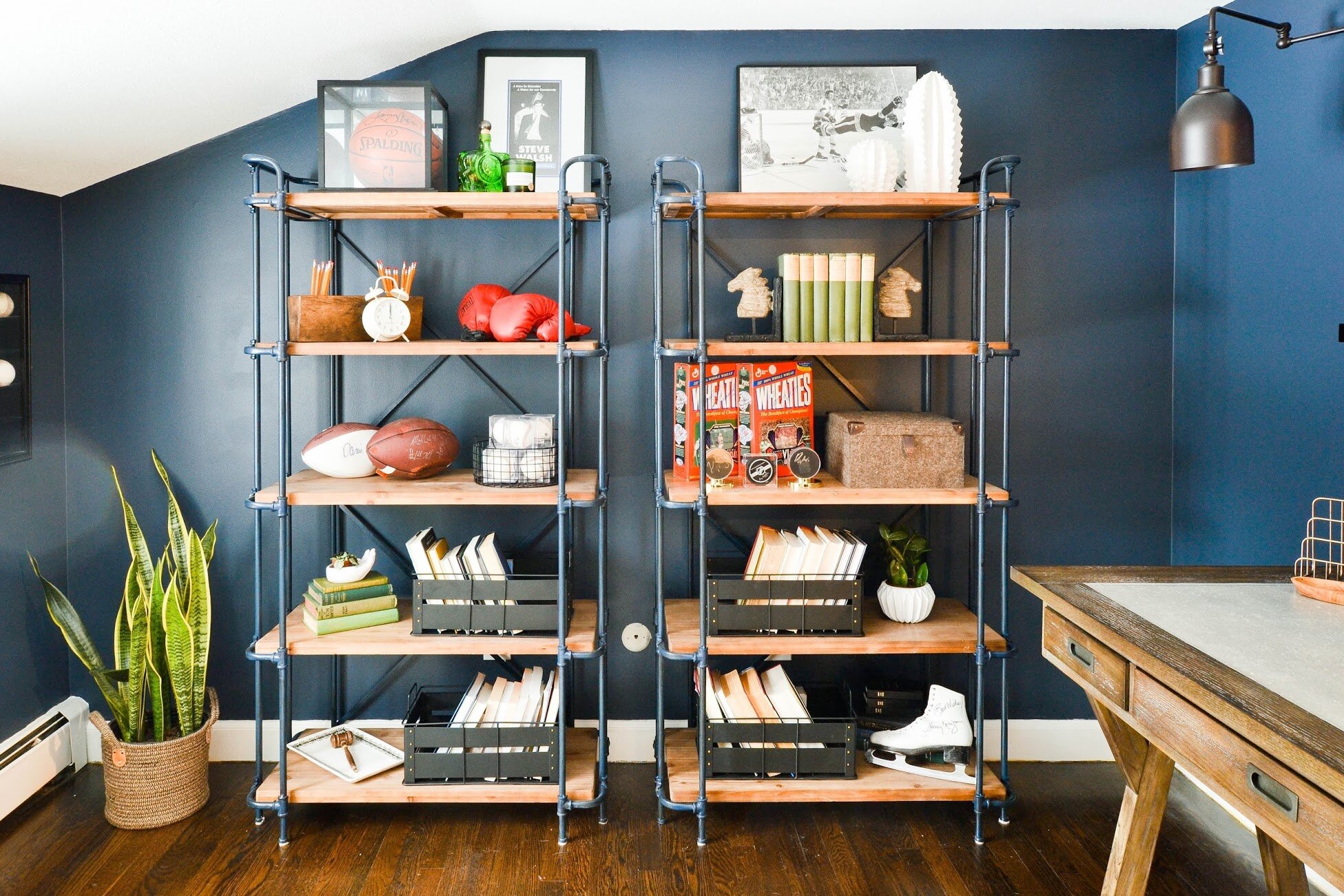
from Mayberry Project (Hale Navy by Benjamin Moore on the walls)
And our most recent nursery need a “Hint of Pink” by Benjamin Moore.

Wall colors are deeply tied to the overall style of a room - there’s no one-size-fits-all solution. We did, however, recently write a round-up of favorite whites. Check it out here.
Have a wonderful weekend.
- Leah