Favorite White Paint Colors - Crowd Sourced Results
/Well hello there! It’s only been 3 months since our last blog post…
Today, we’re back with something really fun. Last week on Instagram we took a poll asking followers to share their “Favorite White Paint Color”. We got so many responses! And we’re not surprised…I mean, we are in fact surprised because it’s always a fun surprise when we get lots of Instalove…but we’re also not surprised because finding the perfect paint color is a universal curiosity (and thorn).
If you scroll through your Pinterest feed after searching “best white paint color” you’ll find lots of excellent resources. Everything from Studio McGee’s recommendations (here and here) to Emily Henderson’s recommendations (here) to every interior designer ever’s recommendations. While there is definitely some notably overlap of designer favorites, everyone has a slightly different take on when and how to use which crisp/cool/soft/warm white. It’s confusing and overwhelming.
The results of our little poll mixes answers from interior design professionals with answers from DIYers with answers from design curious/mildly interested followers. It’s crowd sourcing at its best. And here are the results in a neat little chart.

There were 3 choices that were consistently repeated (all Benjamin Moore colors) - White Dove, Simply White and Chantilly Lace. We thought it would be useful to give you some food for thought on each of these colors because we’ve used them all.
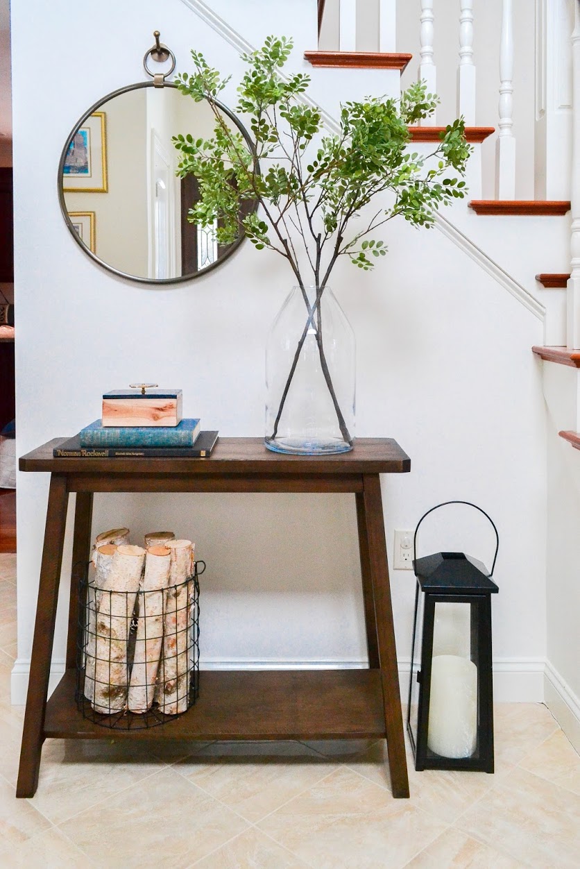
White Dove - This is the warmest white of the top 3 from our survey. The warmer the white, the farther from true/absolute white and closer to its undertone (which in the case of White Dove is beige/tan). Being a warmer white, if you put it against a whiter white on trim/ceiling/cabinet, it will appear creamy. This might be a good thing, might not. It’s very dependent on the context (amount of natural light, direction the house/room faces, etc.). The warmer tone is nice in more traditional spaces. It also has a cozier vibe than starker whites.
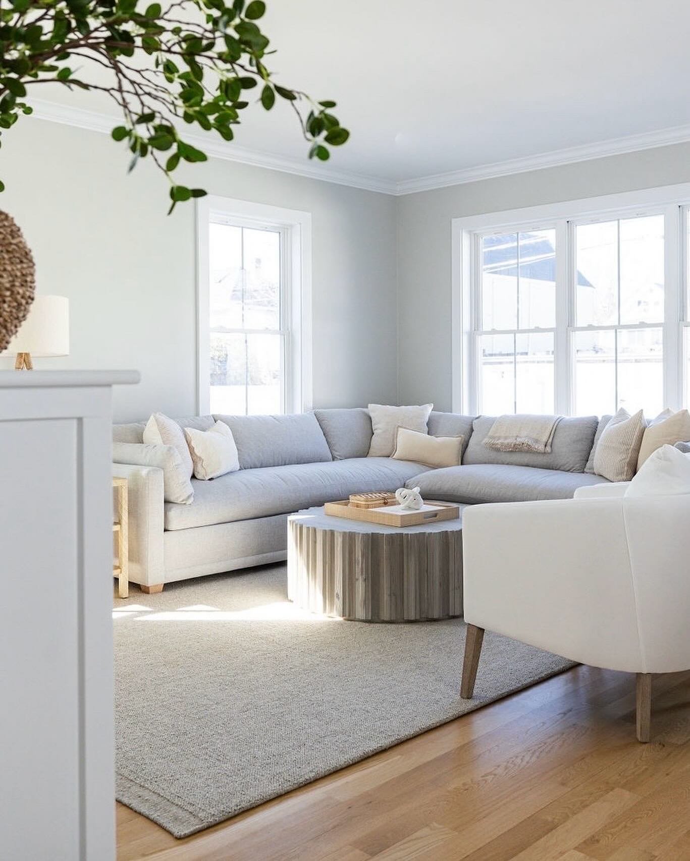
This is the entryway from our Hutchins Project - we used White Dove in this expansive foyer that gets amazing natural light and has many traditional architectural elements.
Simply White - This is a crisper white than Simply Dove, but not extremely so. Because Simply White is closer to an absolutely white, it’s great for brightening spaces that don’t have a lot of natural light. It can appear a touch yellow under some bulb light and against some even whiter whites, so definitely test it out before committing. This is great color for homes with a modern leaning aesthetic where you want to create a fresh and clean vibe.
This is my kids’ bathroom - I used Simply White in this mostly modern space that gets minimal natural light.

acrylic box holder / similar stool / towel ring / mirror / sconce / similar rug
(we’re happy to share shoppable links for our personal projects, for client projects we’re able to share some sources upon request - DM/email us)
Chantilly Lace - This is the brightest white of the 3, coming even closer to absolute white. For modern spaces this is an excellent choice. It’s also great if you want one color for your wall and ceiling to hide unusual architectural elements (think vaulted and quirky ceilings). In spaces with a lot of natural light or a lot of traditional wood tones, it has the potential to feel clinical.
This is our Windsor Project - we used Chantilly Lace in this ultra modern bathroom with little/very little natural light.

{Quick Tip} - The Benjamin Moore website makes it super easy to determine color saturation. First, search your specific color and click on it. You’ll come to a color detail page and there is something that says “LRV” with a number. The closer that number is to 100, the closer that color is to absolute white (absence of all color).
In the end, the only way to find the perfect paint color for your project is to paint a swatch and hang it on the wall. Check it out with the lights on, with the lights off, day, night, stormy, sunny…are you feeling confused and overwhelmed? So maybe don’t feel the need to go that far, but definitely check it out with the lights on and off in all the corners. And know that every paint color in the chart above was someone’s FAVORITE, so they’re all great options.
Be sure to head to our Instagram Story today to participate in our new wall color survey - by request, we’re asking for your favorite pale/soft gray.
Until next week…or next month…
- Leah
*this post contains affiliate links*