Pearl Street Project Reveal - Part 1
/After a bunch of sneak peeks on social media (we couldn't help ourselves), today is the full reveal of our Pearl Street Project. Technically, Part 1 of the full reveal.
This project is different than anything we've previously tackled because it is a city condo versus a suburban house, and for one other crazy reason...which I'll get to. The city condo factor immediately presented some considerations: smaller rooms, multifunctional spaces and storage needs. We'll chat about each factor between this post and next week's (part 2 of the reveal), but let's start with a photo.
All of our designs start by determining the central style of the room. A room is never one style - it's usually a mix of several - but centralizing a room around one general feel/theme/style brings cohesiveness. The most important key to determining the style of a room is, of course, getting to know our client. To do this we talk to our clients about colors they love, stores where they shop, and ask general home design questions (i.e. "how do you feel about color on the wall?" or "is Fixer Upper your favorite show?" or "gingham: love or hate?"). We also take a good look at the current set up of their home - the colors and pieces they instinctively drawn to.
Our Pearl Street Project client has a modern, clean style but isn't afraid of color and eclectic accents. Basically, a dream client! And so, the central style of this project is mid-century modern. But don't miss the layered sprinkles of boho and global stylings.
For this project, we brought in all the furniture with the exception of the couch and the dining room chairs. People often ask if they're allowed to keep some of their existing furniture - if our interior design process is all or nothing. For us, making a home beautiful and functional does not mean putting all existing furniture on the curb and lighting a match (though some of us dream of doing so now and then). Incorporating important, existing pieces into our design is part of our job. And, as I just mentioned, having those pieces is useful in discovering that central style of our design.
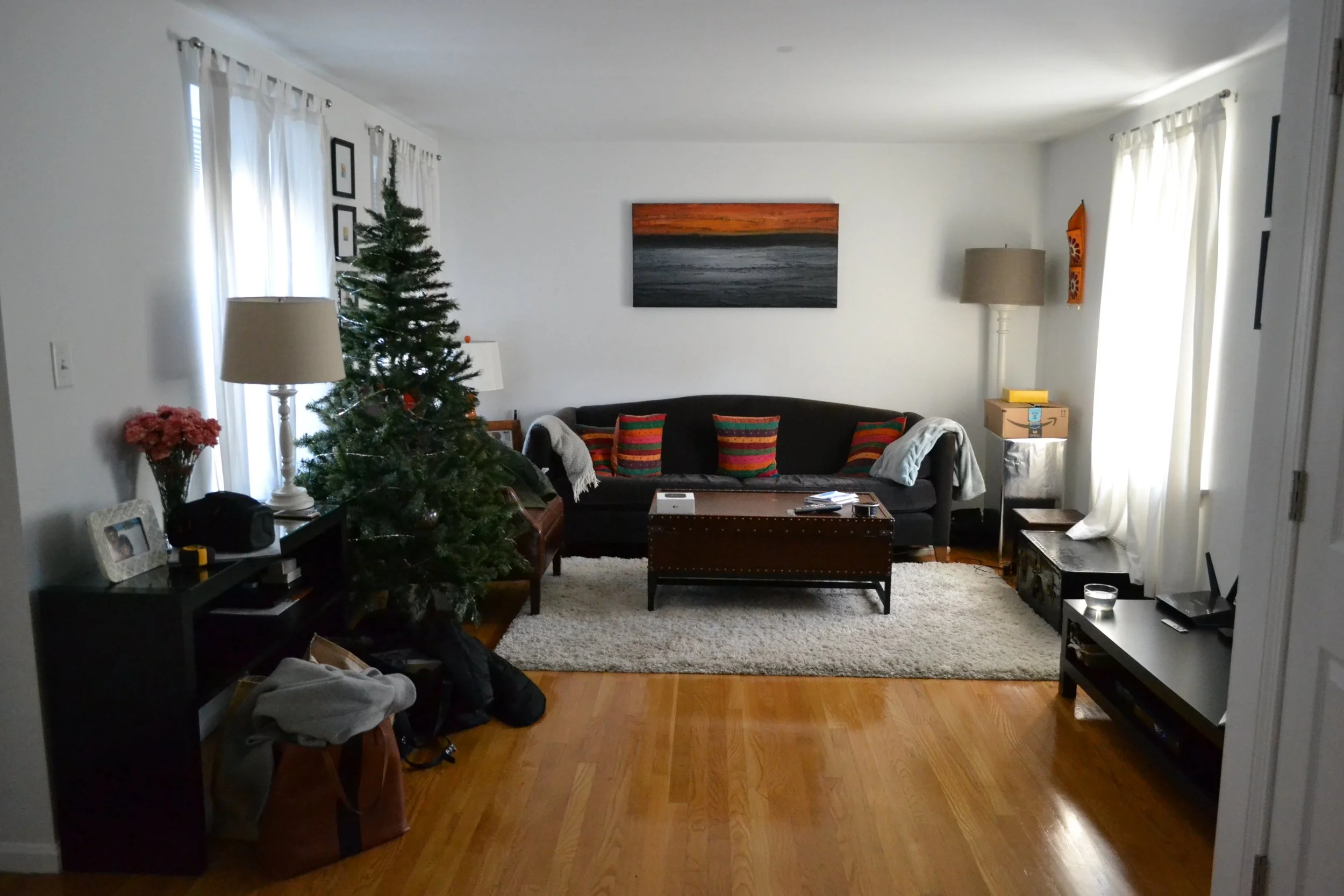
Here is what this room looked like before.
A side-by-side always helps with a comparison.
You'll notice we changed the layout. With the new layout, we fit the maximum seating the space could handle without overcrowding. In smaller rooms people instinctively think they should get small furniture and use is sparsely. In fact, that can make a small space appear even smaller. {Design Tip}: The rules of proportion don't change just because a room is huge or tiny. Use furniture that fills a space without stuffing in too much or leaving pieces lonely and ungrounded.
We love the pair of armchairs (one is above) because they're a great combination of sleek and comfortable. They are something you want to curl up in, but they don't take up a ton of space. And, bonus, they have these beautiful legs that add some negative space. All rooms need a balance of big, heavy pieces and airy, "see through" pieces.
Speaking of airy furniture, this origami coffee table and leggy media console also add to the balance. And the media console does so without sacrificing storage. Look at all those cabinets and drawers. Double win. Wall mounting the television also freed up great space on top of the console for storage (a low profile basket or box would be our recommendation) or just for display of some pretties.
I'm sure you've noticed the colorful dhurrie rug. It's a beauty. We often use blue as a neutral, but for this project it's definitely an accent color. The saturated tone is a great pop against the beiges and grays that ground the style. Oh, and there's also the orange. LOVE, love, love the orange. It's so happy. The painting that was originally where the TV is now wall mounted (scroll up to see) was inspiration for the color palette, including the orange.
Other than this project being in a city condo, we had one other, unusual, consideration - the ceiling of the entire apartment is configured with radiant heat. Wrap your head around that one. We couldn't (and neither could our client). This meant we couldn't add recessed lighting or ceiling fixtures. Nothing. Nada. Our only option was to update existing light fixtures...and there were no existing light fixtures in the living room. #bummer
And so, standing lamps became our next best choice. And if standing lamps are your sole source of lighting in a room, you go big. Hence the awesome arc lamp. And we also added a complimentary cutie in the opposite corner of the room.
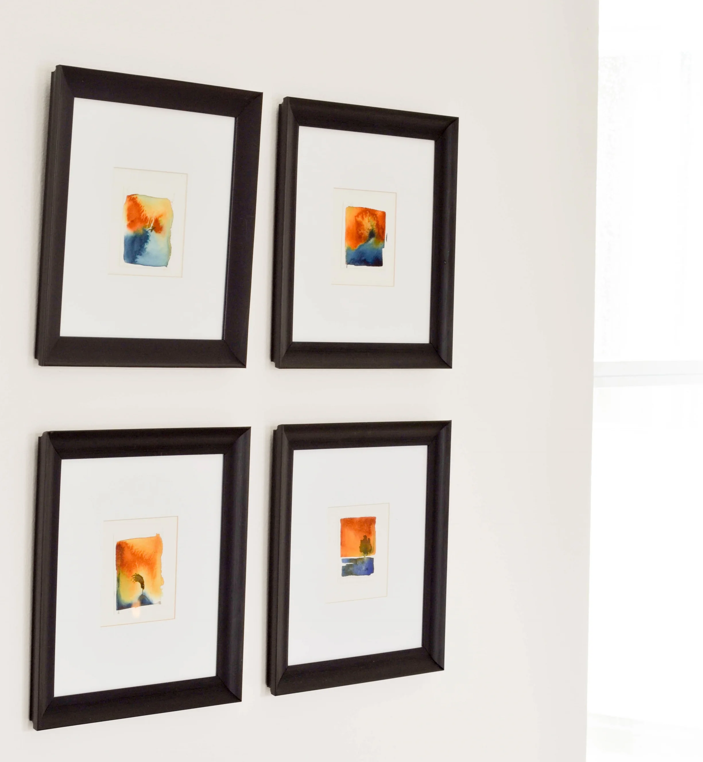
The art in the room was already part of our client's collection, which just gave the pieces a new home. In the photos above you can see where we hung everything. In the photos below you can get a closer peek at the art itself. The artist, Jacob Higginbottom, is local and so very talented.
We also installed some metal "sea urchins" to one side of the television. They're black and brass and dimensional and fun. (Check me out in the reflection in the TV...heehee)
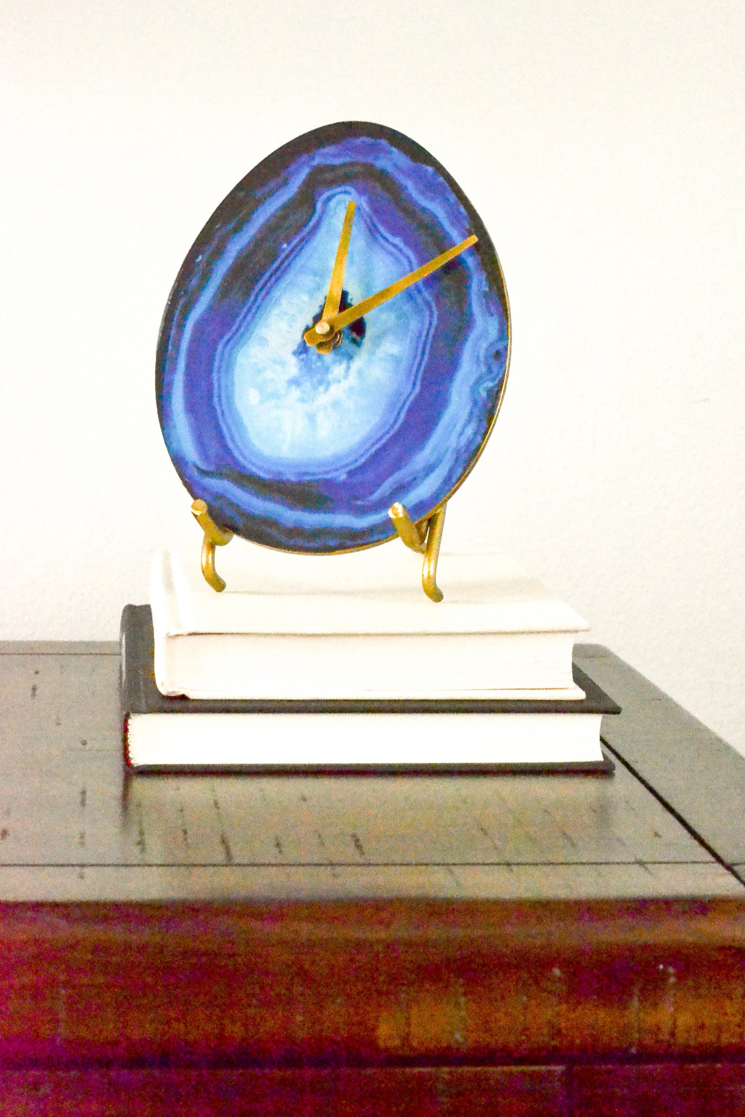
Subtle brass moments throughout the room add touches of warmth to the cool mid-century feel.
Next week we'll show you the dining room and the "entryway"...which is sorta/kinda part of the living room. See that line of a table in the bottom left corner of the photo below? That's the entryway! Stay tuned, more to come next Monday.
Until then, have a great week!
- Leah (and Sonia & Michele)
