Pilgrim Project Dining Room Reveal - Part 1
/Another reveal for you this week! WE LOVE REVEALS!!! It's weeks and weeks of our hard work all rolled into a few images which capture our final vision, they are so much fun! And for this project we actually installed it before Christmas. You may have caught some sneak peaks on Instagram and Facebook. It's a bit excruciating to complete a project and then wait to reveal the finished design. It's like finally buying a pair of ridiculously perfect boots you've been eyeing forever and then putting them in your closet and not wearing them for months on end! Like we said, excruciating. To make matters worse, today's reveal is only Part 1 of 2. This project, our beloved Pilgrim Dining Room Project, has a lot to cover, so we're serving it up in portions.
The project as a whole is in the transitional family (similar to our Homestead Project). But, here we incorporated a lot more natural textures and neutral tones with black accents and pops of green, our favorite. Our client was so trusting as we designed not only a beautiful, but a functional room, for her young, amazing family in the 1920's home that she grew up in. For today's post we're focusing on the dining table and console table.
Before we get too deep into the completed space, let's look back at a before photo.
And a side-by-side.
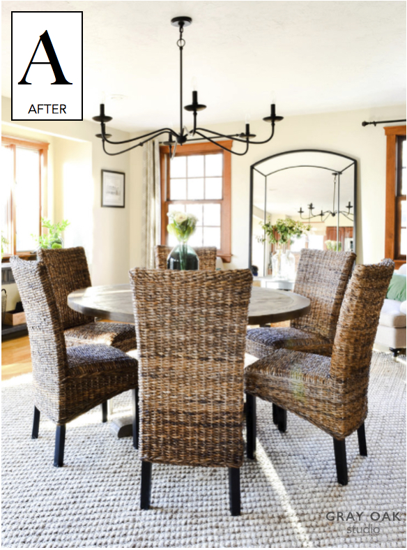
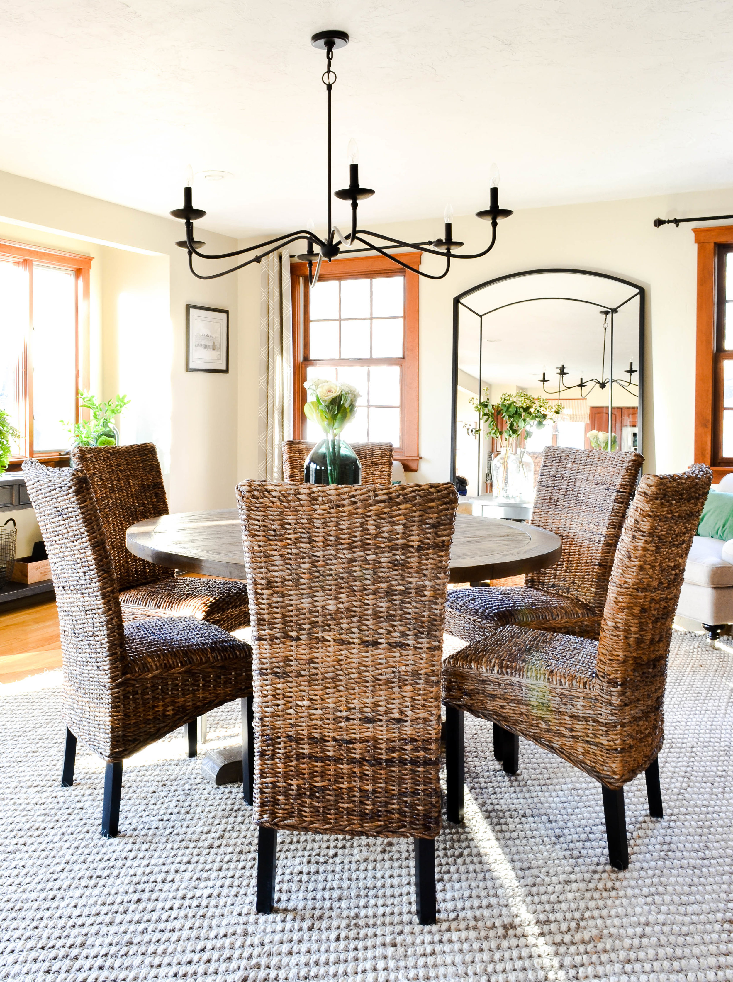
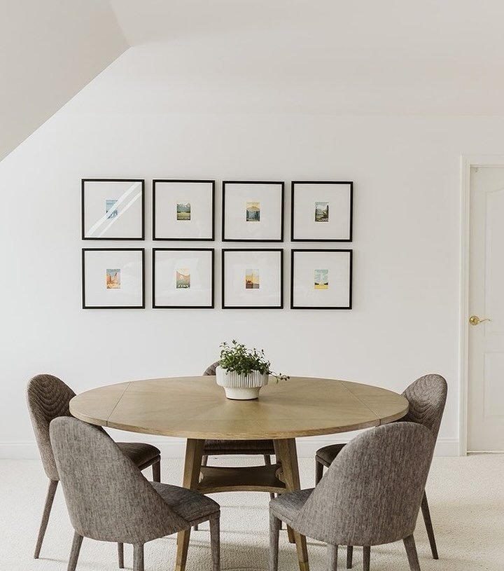
The dining table and chandelier are two changes with huge impact.
We chose a round, pedestal table for a couple reasons. First, it partners well with an open concept space. We all love open concept spaces because they feel so airy and connected, and a round table lends to this feeling - it's visually soft and fluid and allows for your gaze to continue to move around a room. A round table also makes for seamless traffic flow, which is ideal for a large family with fast-moving, traffic-making kiddos. The pedestal base is great for cramming in a few extra chairs when hosting guests.
These awesome dining chairs bring the texture. And we LOVE texture. Texture makes you feel cozy and makes a space feel livable and lived in - like home. These chairs are also surprisingly comfortable and sturdy. Can't overlook practicality when the primary users of a space aren't old enough for a PG-13 movie!
For the table centerpiece, we kept it simple and modern. This green vase is from the Hearth and Hand collection at Target (beautiful and budget-friendly) and these "flowers" are actually in the cabbage family. Seriously!
Finally we make our way to the chandelier. The previous space didn't have any existing lighting above the table. We knew bringing in just the right light fixture would serve both function and design appeal. It's a favorite element for us. It is traditional in its profile, which works so well in this older home. But, the thin, elongated arms and simple lines are wonderfully modern. It's elegant and cool at the same time.
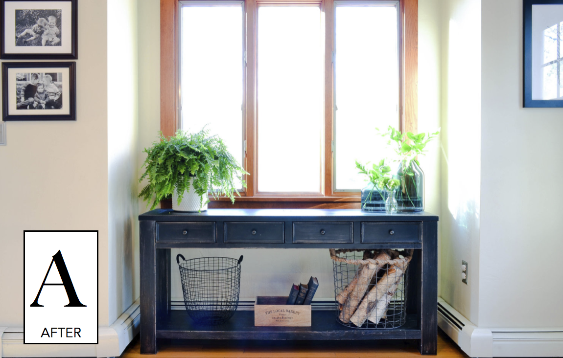
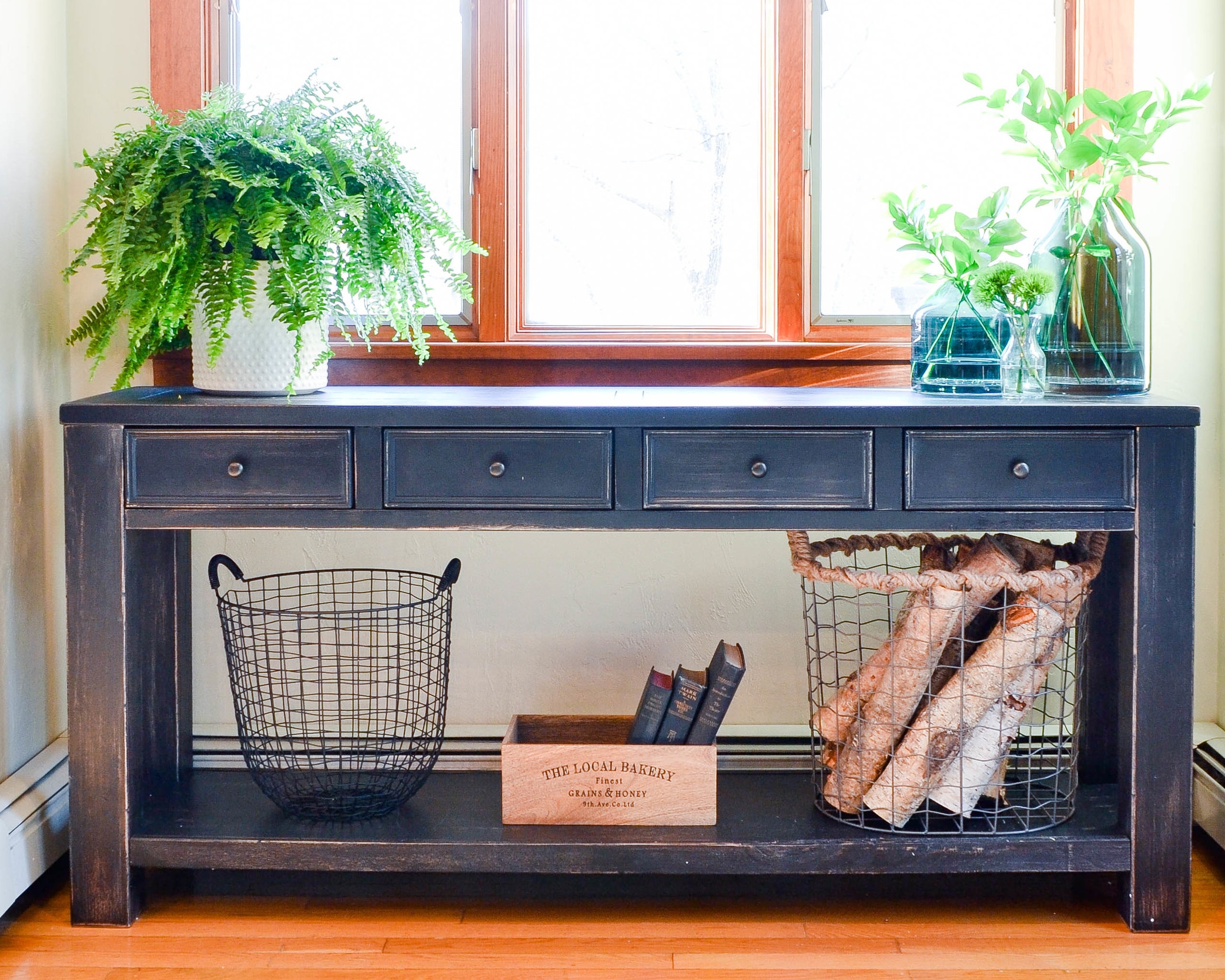
And here's the console table. Doesn't it fit perfectly into this nook? Nooks can be challenging because you need to be especially thoughtful about proportion - are you filling the nook with the appropriate sized piece? But, nooks are also built-in (literally) charm. So, take your time and find the right sized furniture, believe us it is worth it.
Check out a photos of this space before we got our hands on it.
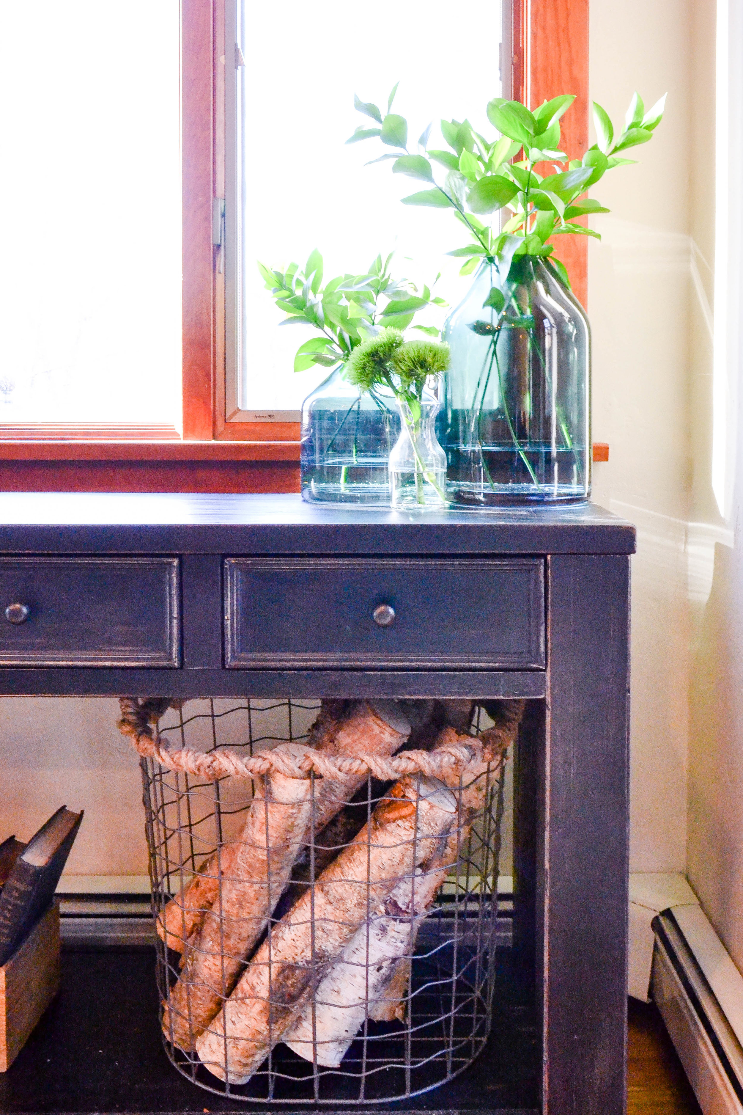
You know how much we love all things green these days (remember the velvet green chair from our Mayberry Project?!!! SO GOOD). Well, for the Pilgrim Project, we brought our love to the next level with some green on green action - fresh cut stems in green vases. And the basket full of birch logs isn't too bad either.
{Design Tip} If your accessories budget is minimal, you'll need to prioritize. Storage and plants should be 1 and 2 on your list. They bring function and mood. And they are beautiful.
Stay tuned for Part 2 of the Pilgrim Dining Room Project reveal, the seating area!
White planter (for Boston fern - left side of console table)
Wood box ("The Local Bakery")


