Making an Entrance
/The entryway of any home is sorta, kinda, very important. Today we're going to explain why it's so very important and how to create your own perfect entryway.
First off, why is an entryway so important anyway? Three big reasons. For starters, it's the first space you see when you enter a home. If you're tripping over shoes, there's no surface to put down your purse and you're constantly losing keys because the key bowl is in the backyard for mudpie purposes, your mood is going to sharply cave. Second, your entryway should give guests welcoming vibes, not deter future visits. Third, an entryway sets the tone for the entire home. Do you want that tone to be chaos...or even just meh? Or, do you want it to be HIGH TEN, this place is the jam.
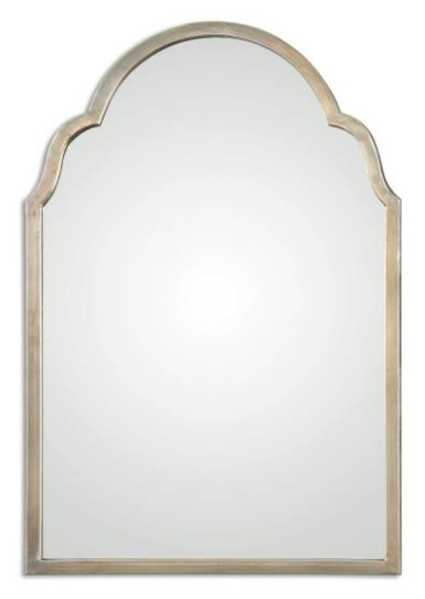
Now we're clear on the why, let's dive into the how. How are you going to create function, charm and beauty all in one, often little, space? The formula is pretty straightforward: storage + mirror + texture = entryway goals. The storage is for all the stuff you enter a home with and immediately want to take off/put down. The mirror is to bounce around whatever natural light is available and is also for the much needed hair and teeth checks before you head out or settle in. The texture is to provide that sense of cozy, comfort and welcome you want to feel when you come home.
rug / wood milk crate with chalkboard / mirror
This entryway is from our Essex Project. Talk about entryway goals. The storage is fantastic and covers all the bases. Shoes and school bags will be tucked away in drawers, coats neatly hung and everything else hidden in crated storage. The crates even have chalkboard fronts for beautiful, functional labels. The mirror is a little hidden in this photograph, but it's across from the bench. Check. And we added texture with the herringbone tile pattern, beadboard, chevron rug, basket and that sneaky plant hiding in an upper cubby.
Now the Essex Project entryway is pretty big. What if you don't have as much space? What if you have a lot less space? The formula still works.
rug / similar basket planter / mirror
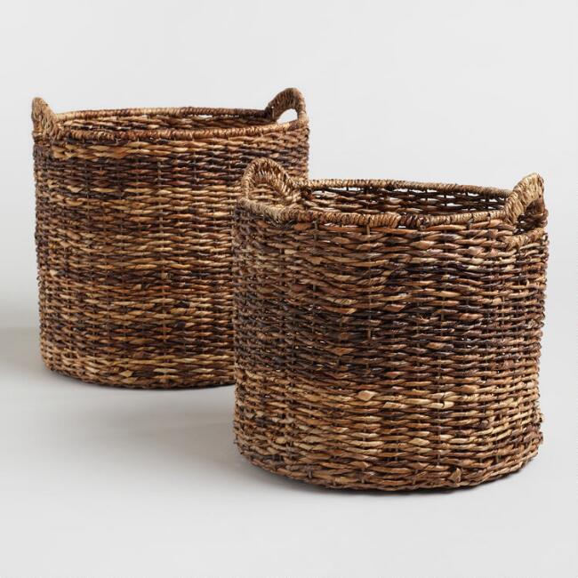
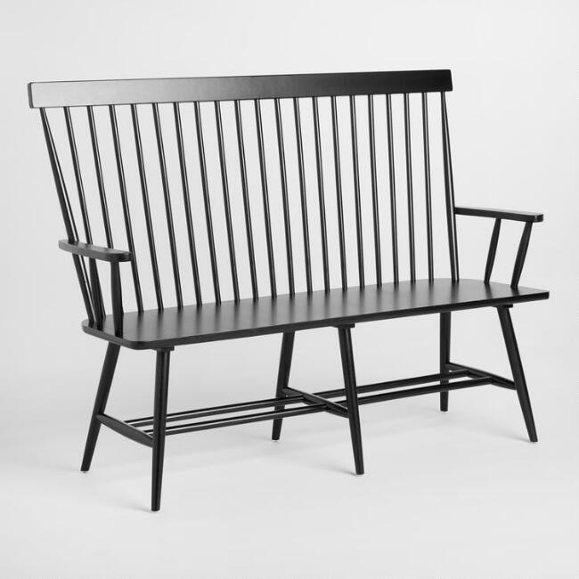
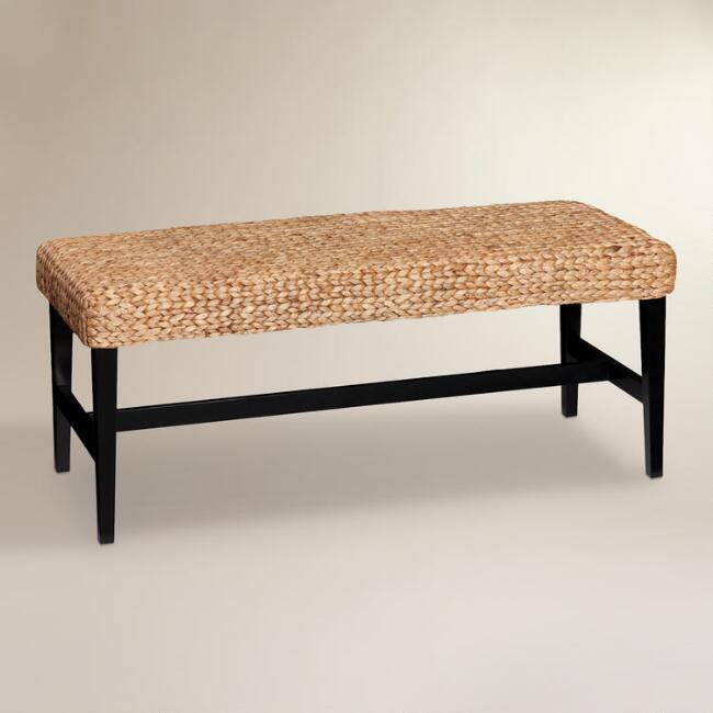
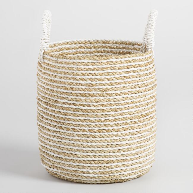
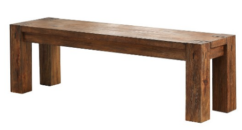
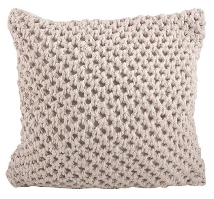
The entryway from our Southend Project is minimalist by design, but still hits all the key elements. The bench and baskets are surface and storage to handle the stuff. The storage element was not as critical in this design because there's a large closet (not photographed) to handle most of the clutter. The mirror is extra large because the natural light in this entryway is extra limited. Texture is everywhere to balance the minimal vibe: under bench baskets, rustic wood, tufted pillow, patterned rug, and a snake plant in a basket planter.
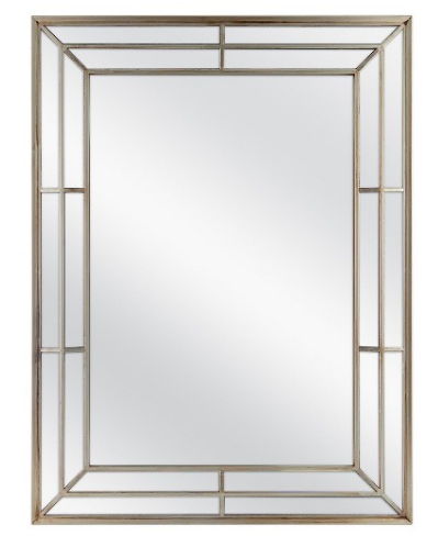
Mirror (get 5% off with code 4E318) / Console Table (get 5% off with code 4E318) / Rug
This entryway is from our Windsor Project. Like the Southend Project, storage wasn't overly prioritized in this space because a separate, family entryway has storage galore. The console table and large baskets are just enough. The window pane mirror hits the mirror element and also provides some texture. More texture comes from the rug, cotton stems, baskets and plant, which give a polished, but cozy feeling.
For the record, we didn't add a separate plant element to the formula because plants are covered under the texture element and because we assume you know that plants should be in every room...and space...and corner.
We would love to hear about and see (tag us on Instagram) your entryway makeovers! Did the formula work for you?
